GFXVoid Graphic Design Forum

Remove Text Formatting
Loading...

» Online Users: 20,793

0 members and 20,793 guests
No Members online

» Site Navigation

 > FAQ

» Stats

Members: 35,442
Threads: 103,075
Posts: 826,688
Top Poster: cc.RadillacVIII (7,429)
Welcome to our newest member, Lekelindids
Page 1 of 2 12 LastLast
Results 1 to 10 of 13

Thread: Morphus Smudge

  1. #1
    Join Date
    Jul 2005
    Posts
    4,368

    Default


    CnC plz

    oh and thx agin lumix


    Death from above!


    (: PPPPINK!!!!!

  2. #2
    Join Date
    Jun 2005
    Location
    U.K.
    Posts
    3,462

    Default

    np dude

  3. #3
    Join Date
    Dec 2005
    Posts
    556

    Default

    Its nice. The text should stand out more imo.

  4. #4
    Join Date
    Oct 2005
    Location
    Australia
    Posts
    330

    Default

    everything is nice and well except the text and the boxes and the rending was choppy

  5. #5
    Join Date
    Jul 2005
    Posts
    4,368

    Default

    how can u tell the rending was choppy when its been smudged?

    but should i current?


    Death from above!


    (: PPPPINK!!!!!

  6. #6
    Join Date
    Dec 2005
    Posts
    75

    Default

    i dont like those lines imo u should get rid of it but nice sig

  7. #7
    Join Date
    Dec 2005
    Posts
    17

    Default

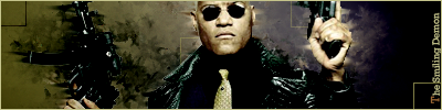
    I like it man specially the effect you have created around his left hand(right hand side of pic), but I think you lost it on the left hand side of the pic.The colour I think lets the feature image down and teh lines you added I don't think go with it aswell.
    Nice job though and I really like you fable sig!

  8. #8
    Join Date
    Oct 2005
    Location
    Australia
    Posts
    330

    Default

    or you didn't blend it well.

    I can see it's choppy by the hands and the guns

  9. #9
    Join Date
    Jun 2005
    Posts
    279

    Default

    Is there a sig for smudging or what ever you did to create that background behind him beuase i see it used alot and realy really really would like to know i have sigs that need it in


    my advice imo i think you should make the text stand out more and take them lines away if it looks 2 empty make the sig smaller do not always create long ones buecase ur idle sig disgner does

  10. #10
    Join Date
    Jul 2005
    Location
    Grudge City Utah
    Posts
    346

    Default

    i think you did a pretty good job, im feelin this sig alot, its dope, keep at it
    Recent :

    [img][/img]


Posting Permissions

  • You may not post new threads
  • You may not post replies
  • You may not post attachments
  • You may not edit your posts
  •  
Powered by vBadvanced CMPS v4.1.1