GFXVoid Graphic Design Forum

Remove Text Formatting
Loading...

» Online Users: 15,921

0 members and 15,921 guests
No Members online

» Site Navigation

 > FAQ

» Stats

Members: 35,442
Threads: 103,075
Posts: 826,688
Top Poster: cc.RadillacVIII (7,429)
Welcome to our newest member, Lekelindids
Results 1 to 5 of 5

Thread: censored

  1. #1
    Join Date
    Apr 2005
    Location
    Behind my desk Status: nub
    Posts
    2,978

    Default


    trying something else

  2. #2
    Join Date
    Nov 2005
    Posts
    204

    Default

    i think the bar should be a little thinner and id like to see the stock not inverted or somethin. the colors seems kinda bland but i think u inverted the whole thing. the colors are mainly what is unappealing to me.

  3. #3
    Join Date
    Dec 2005
    Posts
    17

    Default

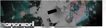
    I would prob have to say well done mate it looks mad just I think that that chicks Facial features should be more distinguished and if you have invert the whole pic includin the chick, I recon u should leave the pic and the chick separate.
    Other than that mate it looks mad!

  4. #4
    Join Date
    Jun 2005
    Posts
    279

    Default

    i really dont like it dont know why but i just dont it brings me back to the old times when i use 2 make it inverted to my cars and send it 2 freinds and tell them i painted it :P lol only thing i like on that pic is the text and otehr thing i like is the sig underneath the current one ur wearing beucase its amazing man i cant get over it its just to good

  5. #5
    Join Date
    Jun 2005
    Posts
    438

    Default

    great stuff, you're improving alot lately, and got a total unique style.
    on this sig, anti-alias the black bar for the eyes..

Posting Permissions

  • You may not post new threads
  • You may not post replies
  • You may not post attachments
  • You may not edit your posts
  •  
Powered by vBadvanced CMPS v4.1.1