GFXVoid Graphic Design Forum

Remove Text Formatting
Loading...

» Online Users: 488

0 members and 488 guests
No Members online

» Site Navigation

 > FAQ

» Stats

Members: 35,442
Threads: 103,075
Posts: 826,688
Top Poster: cc.RadillacVIII (7,429)
Welcome to our newest member, Lekelindids
Results 1 to 4 of 4

Thread: New sigs

  1. #1
    Join Date
    Apr 2005
    Posts
    161

    Default

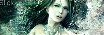
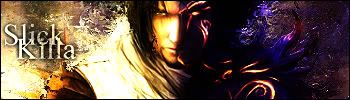
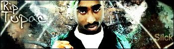
    Here are some of my new sigs


    C&C please

  2. #2

    Default

    first one is good
    2nd one..the right is overdone, especially the render
    and on the 3rd...I don't know the render doesn't really fit in..and those white lines are strange..

  3. #3
    Join Date
    Apr 2005
    Location
    NSW, Australia
    Posts
    1,511

    Default

    1st is good but i think the BG is a bit plain
    2nd right is too dark but it's good
    3rd not liking at all nothing goes together


  4. #4
    Join Date
    Aug 2005
    Location
    UK - Birmingham
    Posts
    1,166

    Default

    i like the 1st and 2nd ones nice job not feeling the last one to much.

    and work on the your text

Posting Permissions

  • You may not post new threads
  • You may not post replies
  • You may not post attachments
  • You may not edit your posts
  •  
Powered by vBadvanced CMPS v4.1.1