0 members and 619 guests
No Members online

» Site Navigation

» Stats
Members: 35,442
Threads: 103,075
Posts: 826,688
Top Poster: cc.RadillacVIII (7,429)
|
-

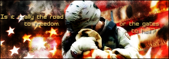
been playing around again, this sig has alot of emotoion, had trouble getting the text to blend but meh, i love it anyways.
-
text doesnt fit, the contrast is wayyyy too high, and, i dont see ure name on it.
-
you calling me a ripper?! lol, just playing with ya, and im still playing around with text, i know its shit.
-
-
text is the wrong colour, and i don't like how contrasted it is
-
The stock colors and the background colors dont go very well together. Make totally new font and color for the text. Good emotion tho!
-
lol I don't think you have to have your name on every sig you make :P
@sig: Make the dark spots lighter and vice versa..
-
aight, i didnt really tiuch brightness contrast, it happened in filters, and i will fix the text ^_^
-
it is contrasted a little to much, and text could be worked on more, great sig overall!
-
the colors are good overall i think it is your best and yeah you dont need a name or anytext on a sig like mine is fine without :X
 Posting Permissions
- You may not post new threads
- You may not post replies
- You may not post attachments
- You may not edit your posts
-
Forum Rules
|


 Reply With Quote


