GFXVoid Graphic Design Forum

Remove Text Formatting
Loading...

» Online Users: 5,145

0 members and 5,145 guests
No Members online

» Site Navigation

 > FAQ

» Stats

Members: 35,442
Threads: 103,075
Posts: 826,688
Top Poster: cc.RadillacVIII (7,429)
Welcome to our newest member, Lekelindids
Page 1 of 2 12 LastLast
Results 1 to 10 of 16

Thread: C&C PLS!

  1. #1
    Join Date
    Jan 2006
    Location
    -E-Town
    Posts
    310

    Default


    alright C&C PLSS thanks u
    EDIT....

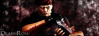
    if your wondering wat i did to krouser i added more detailed scars, turned his eyes white and made the snake sign on his knife more nodicable.


    I Go by Homicide On Other forums

  2. #2
    Join Date
    Apr 2005
    Location
    NSW, Australia
    Posts
    1,511

    Default

    what you did to the render is nice, but what you did with the BG is horrible, it;s boring plain, looks like about two layers, and the monotone makes it look worse, i think you can do better with this, text isn't good either.


  3. #3
    Join Date
    Jan 2006
    Location
    -E-Town
    Posts
    310

    Default

    hmm k wats monotone? and wat style should i use wit this sig? (grunge, abstract) thnaks for the C&C oh and wat to do wit text any ideas for me?


    I Go by Homicide On Other forums

  4. #4
    Join Date
    Apr 2005
    Location
    NSW, Australia
    Posts
    1,511

    Default

    monotone is single coloured

    i'm thinking grunge but you need more detail

    and text go plain black or white, try staying around 14 or smaller for size, and keep more to the corners, and don't add effects


  5. #5
    Join Date
    Jan 2006
    Location
    -E-Town
    Posts
    310

    Default

    allright sweet deal thanks


    I Go by Homicide On Other forums

  6. #6
    Join Date
    Aug 2005
    Location
    HK
    Posts
    2,353

    Default

    Nice manipulation of the render, it's cool. Good job with that.
    I agree with what Sythe said about the BG and text. Try using different fonts and styles for the text, don't just stick with one font.


    <3 Fuzzy

  7. #7
    Join Date
    Jan 2006
    Location
    -E-Town
    Posts
    310

    Default


    how abhout that...anybetter?


    I Go by Homicide On Other forums

  8. #8
    Join Date
    Aug 2005
    Location
    HK
    Posts
    2,353

    Default

    Urmm, coloring is a bit better.
    Now, you gotta blend the render in, some depth..text is a bit better, not sure how you can improve it though, cus i suck at text too :P


    <3 Fuzzy

  9. #9
    Join Date
    Jan 2006
    Location
    -E-Town
    Posts
    310

    Default


    ALRIGHT finnal version i hope her it is

    thkans to bhxTyrant for the blood


    I Go by Homicide On Other forums

  10. #10
    Join Date
    Aug 2005
    Location
    HK
    Posts
    2,353

    Default

    Way better. The white border doesn&#39;t work though, make it black, it&#39;ll be better imo. It&#39;s still lacking depth, but this is much better.
    Nice


    <3 Fuzzy

Posting Permissions

  • You may not post new threads
  • You may not post replies
  • You may not post attachments
  • You may not edit your posts
  •  
Powered by vBadvanced CMPS v4.1.1