0 members and 643 guests
No Members online

» Site Navigation

» Stats
Members: 35,442
Threads: 103,075
Posts: 826,688
Top Poster: cc.RadillacVIII (7,429)
|
-

Sometimes I look at me then I look at the sky then me and then the sky then me again and then I ask GOD -- GOD how is it that you use us to create such crazy, original, impressive, beautiful, creative pieces of artwork and you know what he says he says TresBak TresBak TresBak there can only be ONE Muhaaaahaaaahaaaa and it is not you TresBak it is Meeeeeeeeeeeeeeeee and then I am like ") ok be like that then :P hehe anyways peeps I have knocked out the knicks and my work is more amazing than before IMO anyways C&C peeps ok be like that then :P hehe anyways peeps I have knocked out the knicks and my work is more amazing than before IMO anyways C&C peeps
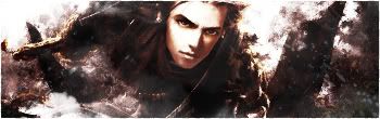
Artistic Perspective

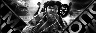
Dramatic Concept
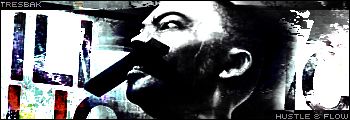
Monotone Style
Neon Style: text redone

Just went Freestyling was bored
Bonus haha needs work IMO
-
1st one text is awesome, but doesn't go with the sig
2nd meh not really liking it, hard too see most of it and i don't like how text hasbeen done
3rd BG doesn't go with corners, render doesn't go with BG, etc.
4th nice the text iis alot better than last time gj
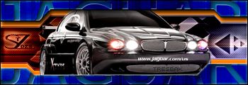
5thget rid of the car and i think that sig will be just fine
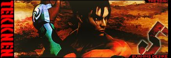
6th tekken text on the left doesn't fit, nice otherwise
-
WOW sythe you never give a overall good rating do you I realy need to see some of your work haha thanks for your opinion though it is really informative
-
^^ I agree with him on all of his statements
-
#1: I like it. Pretty artistic, probably a bit too sharp/grainy. I really like the text, it's great.
#2: Pretty good concept, but dramatic? Maybe not..I like the text though, prolly a bit too white on the right side.
#3: Gotta disagree with what Sythe said. It might look as if everything doesn't go together, but if you look at it a bit longer, you'll see them falling into place.
#4: Lubly, my favourite out of the signatures. DISCO TIME
#5: Like Sythe said, get rid of the car or change the blue border to another color, those two don't go well together.
#6: Too dark and lighting is off. Text don't fit. Da 5 doesn't fit either imo.
Overall they're really good. I really like the text on the first one, great job on them 
-
nice. first one is wicked.
 Posting Permissions
- You may not post new threads
- You may not post replies
- You may not post attachments
- You may not edit your posts
-
Forum Rules
|


 Reply With Quote