GFXVoid Graphic Design Forum

Remove Text Formatting
Loading...

» Online Users: 26,370

0 members and 26,370 guests
No Members online

» Site Navigation

 > FAQ

» Stats

Members: 35,442
Threads: 103,075
Posts: 826,688
Top Poster: cc.RadillacVIII (7,429)
Welcome to our newest member, Lekelindids
Results 1 to 4 of 4

Thread: Hello Climb-X!

  1. #1
    Join Date
    Jan 2006
    Location
    The Void
    Posts
    4

    Default

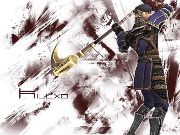
    Hello all! i have Recently Joined Climb-X and is a great forum. will be on as much as i can ^^. here just a pic i recently did using Photoshop CS2


    yes its big :P ... i didnt notice the size when i had made it.My favs parts is the Font, the position of my Character, and the background. i think its not bad concidering im a little new to Photoshop

  2. #2
    Join Date
    Oct 2005
    Location
    Australia
    Posts
    330

    Default

    the bg and the render just don't fit together, i don't really like the colors on the bg, and the render defentaly needs blendingg. the text i so-so

    Try look at so of the nice tuts Climb has got and yuo'll be gettin better in no time

  3. #3
    Join Date
    Apr 2005
    Location
    Scotland
    Posts
    2,177

    Default

    look at our tuts section.
    About the sig: the background is monotone which makes the sig look boring and also odd because the render is coloured. Also ur sig size is way to big mayb try 300 * 120 thats wha i use......

  4. #4
    Join Date
    Jan 2006
    Location
    The Void
    Posts
    4

    Default

    ty for the hints, will take note to it. i use fractals alot and alot of abstract brushes.

Posting Permissions

  • You may not post new threads
  • You may not post replies
  • You may not post attachments
  • You may not edit your posts
  •  
Powered by vBadvanced CMPS v4.1.1