GFXVoid Graphic Design Forum

Remove Text Formatting
Loading...

» Online Users: 9,716

0 members and 9,716 guests
No Members online

» Site Navigation

 > FAQ

» Stats

Members: 35,442
Threads: 103,075
Posts: 826,688
Top Poster: cc.RadillacVIII (7,429)
Welcome to our newest member, Lekelindids
Page 1 of 2 12 LastLast
Results 1 to 10 of 13
  1. #1
    Join Date
    Apr 2005
    Location
    San Francisco
    Posts
    2,745

    Default


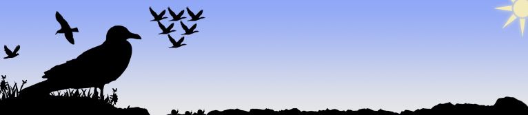
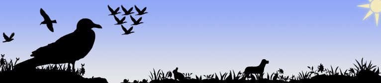
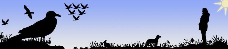
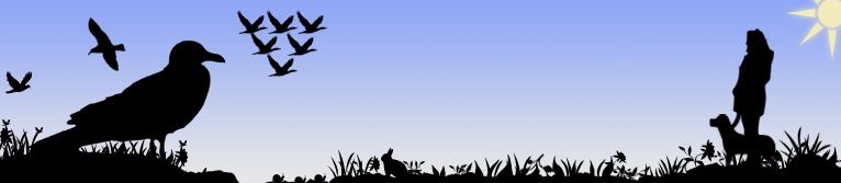
    Progression of the image. It started off black and white, and now it's that. Not done yet, going to add more detail to the sky and that sort of thing, possibly more plants. Not sure where I completely want to go with it, but keep it mind, there are a lot of details.

    Comments appreciated.

  2. #2
    Join Date
    May 2005
    Location
    Manitoba, Canada
    Posts
    724

    Default

    to me all looks good except for that triangle of birds. and i personally dont think this should be for a portfolio...i cant explain tough

  3. #3
    Join Date
    Apr 2005
    Posts
    5,855

    Default

    Originally posted by Stefan Sobering@Jan 12 2006, 03:50 AM
    i personally dont think this should be for a portfolio...
    [snapback]105498[/snapback]
    exactly what I was gonna say.
    It could be ok as an experimental image, or something, but definitely not as a banner.
    frankly, it's too boring. too flat and.. well, yeah, boring's the word. sorry.

  4. #4
    Join Date
    Dec 2005
    Posts
    556

    Default

    That has a nice atmosphere. 1st is best.

  5. #5
    Join Date
    Apr 2005
    Location
    San Francisco
    Posts
    2,745

    Default

    Don't apologize for honesty. I can take feedback, and I appreciate the honesty. If you think it sucks, go ahead and say so, element was honest, and i tihnk it helps. So if you're going to comment on my work, go ahead and say anything you like, because I'm not going to flip out.

    I'm actually agreeing that it's a tad strange for a banner, thanks for the feedback, it's having trouble matching the template colors anyways.

    newer version inside of template


    and I agree it looks weird in there. I've worked decently hard on both, and that's not the most recent version.

  6. #6
    Join Date
    Apr 2005
    Posts
    5,855

    Default

    Maybe make the purple part B&W.
    Take off the "tooled designs" part, just leave it as will's portfolio.
    Take off the navigation text too, when you're gonna have buttons there it's gonna be obvious what it is.

    Let me tell you something he1z himself told me, when you make a portfolio, make sure that NOTHING in the site's design is as good as the works themselfs.

  7. #7
    Join Date
    Jul 2005
    Posts
    4,368

    Default

    it would work there i think if u made the top left bit a purple coulered thing.

    but i also agree with Metal in that last bit... but saying that dont make it look bad!


    Death from above!


    (: PPPPINK!!!!!

  8. #8
    Join Date
    Apr 2005
    Location
    San Francisco
    Posts
    2,745

    Default

    I'll try some stuff, thanks for the comments.


  9. #9
    Join Date
    Apr 2005
    Location
    long a
    Posts
    1,642

    Default

    Take out that one dotted line beside the nav, just leave the whole middle open for content. Also change the font to helvectia or w.e.

    EDIT: maybe leave the colors for the previews, just make the banner black and white.

  10. #10
    Join Date
    Apr 2005
    Location
    San Francisco
    Posts
    2,745

Posting Permissions

  • You may not post new threads
  • You may not post replies
  • You may not post attachments
  • You may not edit your posts
  •  
Powered by vBadvanced CMPS v4.1.1