GFXVoid Graphic Design Forum

Remove Text Formatting
Loading...

» Online Users: 6,793

0 members and 6,793 guests
No Members online

» Site Navigation

 > FAQ

» Stats

Members: 35,442
Threads: 103,075
Posts: 826,688
Top Poster: cc.RadillacVIII (7,429)
Welcome to our newest member, Lekelindids
Results 1 to 6 of 6

Thread: New1

  1. #1
    Join Date
    Jan 2006
    Posts
    40

    Default

    hey guys just whipped this one upquick so wat u think?


  2. #2
    Join Date
    Jan 2006
    Posts
    41

    Default

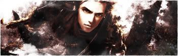
    It's nice, but I think theres a little bit too much going on. Also, sort the text, it doesn't look right there.

    I also have to say that I <3 your current muchos.

  3. #3
    Join Date
    Jan 2006
    Posts
    40

    Default

    cheers dude i like your currnet also nice work

  4. #4
    Join Date
    Dec 2005
    Posts
    556

    Default

    Too much going on, it needs a bare spot.

  5. #5
    Join Date
    Aug 2005
    Location
    Nyköping, Sweden
    Posts
    1,908

    Default

    bg needs some sort of focalpoint imo
    also for this one, make the render stick out more :P

  6. #6
    Join Date
    Jan 2006
    Location
    -E-Town
    Posts
    310

    Default

    hmm i think u should blend the render more?


    I Go by Homicide On Other forums

Posting Permissions

  • You may not post new threads
  • You may not post replies
  • You may not post attachments
  • You may not edit your posts
  •  
Powered by vBadvanced CMPS v4.1.1