GFXVoid Graphic Design Forum

Remove Text Formatting
Loading...

» Online Users: 3,328

0 members and 3,328 guests
No Members online

» Site Navigation

 > FAQ

» Stats

Members: 35,442
Threads: 103,075
Posts: 826,688
Top Poster: cc.RadillacVIII (7,429)
Welcome to our newest member, Lekelindids
Results 1 to 10 of 10

Thread: 13

  1. #1
    Join Date
    Aug 2005
    Location
    Nyköping, Sweden
    Posts
    1,908

    Default


  2. #2
    Join Date
    Aug 2005
    Location
    UK - Birmingham
    Posts
    1,166

    Default

    ooo i like, simple but effective good work

  3. #3
    Join Date
    Aug 2005
    Location
    Nyköping, Sweden
    Posts
    1,908

    Default

    thx

  4. #4
    Join Date
    Jul 2005
    Location
    London, England
    Posts
    209

    Default

    Thats a beautiful sig mate, great work

  5. #5
    Join Date
    Jun 2005
    Location
    U.K.
    Posts
    3,462

    Default

    Good work.

  6. #6
    Join Date
    Aug 2005
    Posts
    32

    Default

    Very Nice.

  7. #7
    Join Date
    Jan 2006
    Posts
    130

    Default

    really nice flow to it :P

  8. #8
    Join Date
    Aug 2005
    Location
    HK
    Posts
    2,353

    Default

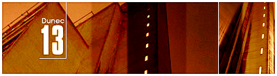
    lol..reminds me of lumix's coffee sig..
    but still, nice work. you improved a lot


    <3 Fuzzy

  9. #9
    Join Date
    Apr 2005
    Location
    NSW, Australia
    Posts
    1,511

    Default

    nice, i just don&#39;t think it really all goes together with the text.


  10. #10
    Join Date
    Aug 2005
    Location
    Nyköping, Sweden
    Posts
    1,908

    Default

    hehe, thx for the comments guy

    @Chucks Lol, yeah Lumix&#39;s coffee sig DID inspire me^^

    @Sythe the nr 13 is just a random nr, doesnt mean anything lol

Posting Permissions

  • You may not post new threads
  • You may not post replies
  • You may not post attachments
  • You may not edit your posts
  •  
Powered by vBadvanced CMPS v4.1.1