0 members and 3,019 guests
No Members online

» Site Navigation

» Stats
Members: 35,442
Threads: 103,075
Posts: 826,688
Top Poster: cc.RadillacVIII (7,429)
|
-
-

Lol, they all look really really odd to me O.o, but for some reason I like them, v2 looks best!
-
dont like, not good on the eyes.
-
I don't really like this one. there is too much of the blurred man showing, but a very neat concept
-
It should be the other way around, the background should be blurred (only enough to get the dof, you must still be able to make out what is) and the foreground with the dude in it should be clear. I think that set up would look a little better. It has a good feel to it though.
-
I agree with jack but the background shouldnt be as blured as the guy is or if you want to keep it like it is at the moment use less blur on the guy if you still have the original render.. 
-
nice, like dof been trying to experiment with it also,nice colors
-
Yeah dawg, I am da kew chickun,,,m,mdsvc,,,
Anyway
v2 is <3333
just lessen the blur
-
Thanks for the comments.
NEW SIG
-
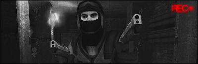
That one's cool ^ too monotone though (for me), but still nice idea.
You should make it more low quality looking on the edges (like a security camera)...
 Posting Permissions
- You may not post new threads
- You may not post replies
- You may not post attachments
- You may not edit your posts
-
Forum Rules
|


 Reply With Quote

