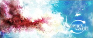
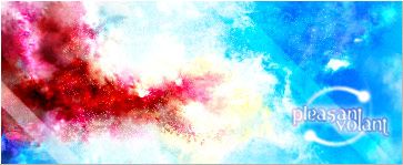
GFXVoid Graphic Design Forum

Remove Text Formatting
Loading...

» Online Users: 5,557

0 members and 5,557 guests
No Members online

» Site Navigation

 > FAQ

» Stats

Members: 35,442
Threads: 103,075
Posts: 826,688
Top Poster: cc.RadillacVIII (7,429)
Welcome to our newest member, Lekelindids
Page 1 of 2 12 LastLast
Results 1 to 10 of 11

Thread: pleasant

  1. #1
    Join Date
    Nov 2005
    Location
    Norway
    Posts
    108

    Default

    v1


    v2


    v3


    v4

  2. #2
    Join Date
    Apr 2005
    Location
    Scotland
    Posts
    2,177

    Default

    i think v3 but i think the text cud b better :P...i lik the idea wit the text just no the font gj tho!

  3. #3
    Join Date
    Nov 2005
    Location
    Norway
    Posts
    108

    Default

    Thanks.

    Yeah, I think I was a bit quick when I chose the font. I'll see what I can do...

  4. #4
    Join Date
    Aug 2005
    Location
    Nyköping, Sweden
    Posts
    1,908

    Default

    Would be ALOT better if it weren't so oversaturated..
    But if I had to choose I'd pick v3..

  5. #5
    Join Date
    Nov 2005
    Location
    Norway
    Posts
    108

    Default

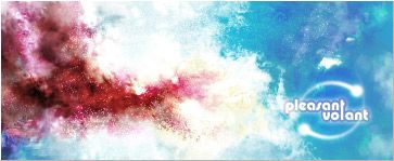
    Well then, here's v3 again, 'remixed'. Different font(s), lower saturation. It does look better.


  6. #6
    Join Date
    Jan 2006
    Location
    London, England
    Posts
    547

    Default

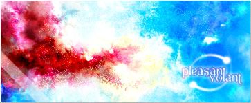
    V3 ftw, maybe if u gave it a gradient map at low oppacity with a mild colour it wont be so contrasting.

  7. #7
    Join Date
    Nov 2005
    Location
    Norway
    Posts
    108

    Default

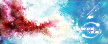
    Here I did some more changes... Not sure about the lines there though.


  8. #8
    Join Date
    Aug 2005
    Location
    Nyköping, Sweden
    Posts
    1,908

    Default

    The newest is much much better imo :P
    But the lines interfere with the flow

  9. #9
    Join Date
    Nov 2005
    Location
    Norway
    Posts
    108

    Default

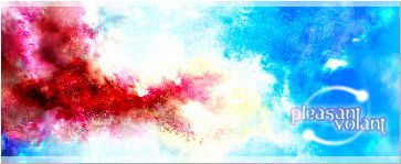
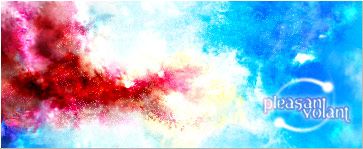
    Ah. How come you guys see 'everything'? :P

    This is final...for now.


    And here's a request I just got finished.
    Didn't put as much work into this one, but I still like it enough to have problems giving it away.


  10. #10
    Join Date
    Nov 2005
    Location
    Massachussets
    Posts
    12

    Default

    Looks a lot better, Volant. :P Is that font, "Alba"?

    And the new one looks good, maybe add some more contrast though?

Posting Permissions

  • You may not post new threads
  • You may not post replies
  • You may not post attachments
  • You may not edit your posts
  •  
Powered by vBadvanced CMPS v4.1.1