GFXVoid Graphic Design Forum

Remove Text Formatting
Loading...

» Online Users: 791

0 members and 791 guests
No Members online

» Site Navigation

 > FAQ

» Stats

Members: 35,442
Threads: 103,075
Posts: 826,688
Top Poster: cc.RadillacVIII (7,429)
Welcome to our newest member, Lekelindids
Results 1 to 4 of 4

Thread: Bleach

  1. #1
    Join Date
    Jun 2006
    Posts
    63

  2. #2
    Join Date
    Jun 2005
    Posts
    1,078

    Default

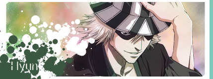
    It's pretty good, but I think it would look better without the character in there. Also, you might want to change that text. It's difficult to read and doesn't fit too well. I think a font that is a little bit more irregular and slightly more like handwriting would look good. The reason for that is (assuming you took the character out) it has a lighthearted/artistic/playful feel to it. Something like arial (for example) with such a defined structure conflicts with it I think. I like how you were a little different with the border. Keep it up

  3. #3
    Join Date
    Jul 2006
    Posts
    23

    Default

    Hot, I like.

  4. #4
    Join Date
    Aug 2005
    Location
    Nyköping, Sweden
    Posts
    1,908

    Default

    The splatter doesnt really fit imo and the stock needs blending, but I kinda like the bg

Posting Permissions

  • You may not post new threads
  • You may not post replies
  • You may not post attachments
  • You may not edit your posts
  •  
Powered by vBadvanced CMPS v4.1.1