GFXVoid Graphic Design Forum

Remove Text Formatting
Loading...

» Online Users: 2,296

0 members and 2,296 guests
No Members online

» Site Navigation

 > FAQ

» Stats

Members: 35,442
Threads: 103,075
Posts: 826,688
Top Poster: cc.RadillacVIII (7,429)
Welcome to our newest member, Lekelindids
Results 1 to 7 of 7

Thread: sam. champloo

  1. #1
    Join Date
    Jun 2005
    Location
    NSW, Australia
    Posts
    3,262

  2. #2
    Join Date
    Dec 2005
    Posts
    556

    Default

    wolfmother sucks ass

    good sig

  3. #3
    Join Date
    Jul 2005
    Posts
    4,368

    Default

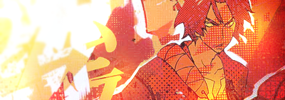
    dont like the white bit on the left.. its too bright.


    Death from above!


    (: PPPPINK!!!!!

  4. #4
    Join Date
    Apr 2005
    Posts
    941

    Default

    Not really liking all those dots, and it's kinda messy.

  5. #5
    Join Date
    Jun 2005
    Location
    U.K.
    Posts
    3,462

    Default

    I like it..
    Reduce the vertical height a bit though =)
    Crop about 20 pixels off the bottom and add some handwritten style text to it..

  6. #6
    Join Date
    Mar 2006
    Posts
    1,544

    Default

    yeah, take some off the bottom
    and, take the dots off his face, leave the rest
    ------

  7. #7
    Join Date
    Aug 2005
    Location
    Nyköping, Sweden
    Posts
    1,908

    Default

    If something has samurai champloo in it, its awesome

Posting Permissions

  • You may not post new threads
  • You may not post replies
  • You may not post attachments
  • You may not edit your posts
  •  
Powered by vBadvanced CMPS v4.1.1