


--Splinter Cell
I had some fun messing with these stocks and doing all the colors and stuff... it was just fun.. I love this one..
This is version 1, as you can tell the left side is a bit plane, but I liked the font effects I came out with.
That is version 2.
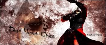
--Devil Never Cries ( DMC )
Really this was me just messing around with my nephew and it came out looking cool as ... ya know.. Haha I like it.
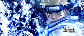
--Naruto
I made this one for my brother because he was complaining.. he goes by Wolfwood..Although I may change it because I adore the blues in this sig.
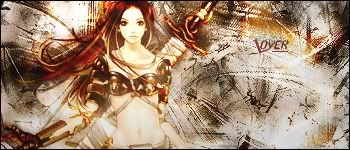
--The Lover
This one I made for my girlfriend, nuff said, she enjoyed it.. and I had a lot of fun making it
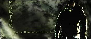
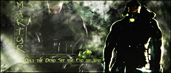
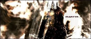
--The Martyr
This was one I recently posted and someone told me to take off the drop shadow off of the text.. So I did.. heres version 2 first, and version 1 second just to recap.
v2
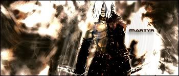
v1
I had fun and really could use some cnc... I wont change much on the images to be honest.. I'll take any advice into consideration onto my future deviations. Thanks! <3 to CX!!!!


 Reply With Quote

