GFXVoid Graphic Design Forum

Remove Text Formatting
Loading...

» Online Users: 2,666

0 members and 2,666 guests
No Members online

» Site Navigation

 > FAQ

» Stats

Members: 35,442
Threads: 103,075
Posts: 826,688
Top Poster: cc.RadillacVIII (7,429)
Welcome to our newest member, Lekelindids
Results 1 to 3 of 3

Thread: Annihilation

  1. #1
    Join Date
    Apr 2006
    Location
    Houston, Texas (USA)
    Posts
    29

    Default

    I've wanted to post past siggies up here, though since most of them are crap, I've avoided it. Seriously, comparison to some of the others on here just makes me depressed. But whatever, I cracked my shell, and here's some random crap.


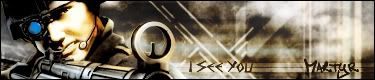
    Never could get the light right on the left side, Though this is the only version that survived my wrath of deletion.
    I know the text looks bad, and as explained in previous topics, not once in my entire history of PS work have i ever fit in text that looked right. So... Yeah.
    Seriously need pointers on making light look...eh...like light, and not crap. But hey, I tried my best, and I want to improve. Thats all that matters, right?

  2. #2
    Join Date
    Aug 2006
    Posts
    39

    Default

    looks coool.. I love that render.. >_>; I need to make something with it.. lol gj!

  3. #3
    Join Date
    Sep 2006
    Posts
    12

    Default

    looks good, but looks like its mostly motion blur, and text accually looks okay.

Posting Permissions

  • You may not post new threads
  • You may not post replies
  • You may not post attachments
  • You may not edit your posts
  •  
Powered by vBadvanced CMPS v4.1.1