


I recently got Adobe PhotoShop CS2 and have been manipulating my photos. I have not used any complete tutorials just elements from each tutorial in my photography magazine.
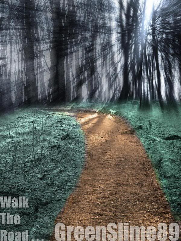
Here is my most recent manipulation:
I took this photo:
And opened it in CS2 and then duplicated the layer and added a radial blur (zoom) to it (top right hand corner). I changed opacity of the blurred layer so it I could see the blur. After that I selected the blur layer again and used the eraser tool (200 pix) and erased up to the grass. Then I selected the path and added a photo filter to it (Warming 85) and then I adjusted the density untill the colour of the path looked like what I wanted it to. Then I repeated this with a different filter for the grass. Then I added the text (same font as my previous three manipulations - sorry, I will fix it when I have enough time) and adjusted the opacity untill it looked good.
Here is the finished result:
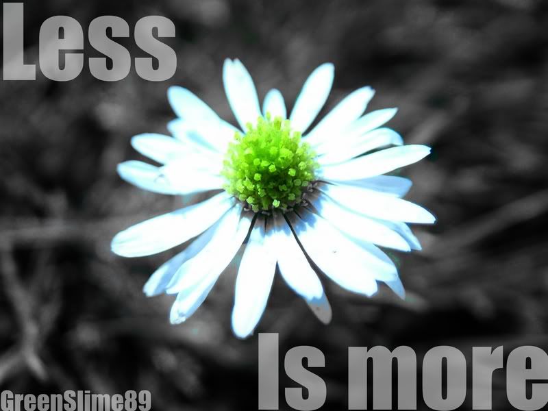
Here's my second manipulation:
After posting my first manipulation on another forum I was told by a forum user that "Less is more" and posted a manipulation as an example. So I kinda copied it but don't flame me - I'm not very good at brainstorming Ideas
So here it is:
The original:
There's not much done - just desaturated the background. I have been in an IMPACT font mood these days so flame my font
Constructive critisism please?
I just noticed that I have capitals on "Less" and "Is" but not on "More"
Just desaturated the background, boosted the levels of the flower and slapped some text on it. Not alot done there.
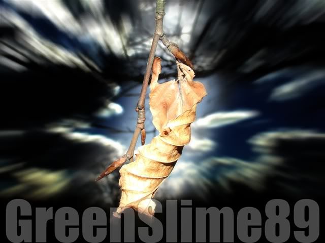
Here's my first manipulation
Original:
Manipulation:
I just selected the background then changed the levels then with the background still selected, applied a radial blur and slapped some text on it.
So any constructive critism will be appreciated.
P.S I have just finished a fourth manipulation (similar to "Less Is More") but it needs some tidying up before it's worthy to post.


 Reply With Quote