GFXVoid Graphic Design Forum

Remove Text Formatting
Loading...

» Online Users: 26,370

0 members and 26,370 guests
No Members online

» Site Navigation

 > FAQ

» Stats

Members: 35,442
Threads: 103,075
Posts: 826,688
Top Poster: cc.RadillacVIII (7,429)
Welcome to our newest member, Lekelindids
Results 1 to 7 of 7

Thread: One more

  1. #1
    Join Date
    Apr 2005
    Location
    Singer Island, FL
    Posts
    5,206

    Default One more

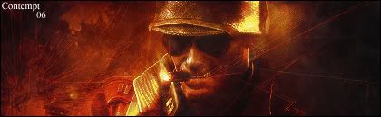
    Just an atttempt to work on lighting. All defaults.

  2. #2
    Join Date
    Oct 2006
    Location
    Canada
    Posts
    141

    Default

    not bad...it could use some work but i like it but i am also working on lighting to so...dont listen to me..lol good job though
    °b A y°
    - R e c e n t -
    - F a v -

  3. #3
    Join Date
    Oct 2006
    Posts
    23

    Default

    i think it looks good only think i wouls say is maybe do something with the text. But that seems to be ur style looking at ur sig and the sig u posted which is still cool


  4. #4
    Join Date
    Apr 2005
    Location
    Singer Island, FL
    Posts
    5,206

    Default

    Yeah, text has always been an issue for me, with my last group of sigs it is just an anti-ripping device.

  5. #5
    Join Date
    Sep 2006
    Location
    Italy - Milan
    Posts
    314

    Default

    I think it's not a bad try, maybe the render should stand out a little bit more..

  6. #6
    Join Date
    Dec 2006
    Posts
    26

    Default

    The render is overblended and the text is sort of generic (like mine haha) but it looks freakin awesome.


  7. #7
    Join Date
    Nov 2005
    Location
    Texas, USA
    Posts
    168

    Default

    Lighting is okay, a little dark in some spots though. Overall good job

Posting Permissions

  • You may not post new threads
  • You may not post replies
  • You may not post attachments
  • You may not edit your posts
  •  
Powered by vBadvanced CMPS v4.1.1