0 members and 3,094 guests
No Members online

» Site Navigation

» Stats
Members: 35,442
Threads: 103,075
Posts: 826,688
Top Poster: cc.RadillacVIII (7,429)
|
-
 g e a r s of w a r g e a r s of w a r
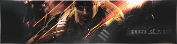
idk, not quite what I was aiming for, but it still turned out pretty decently. Tell me what I should add/remove, and just tell me what you think.
I'm not too fond of the text right now, so it's a WIP...
and should I current it?
-nyhl
-
i think its pretty sweet. 10x sexier than anything i could ever make, but thats not saying much. anyway i actually like it but the c4d on his face can be a little distracting.
-
Updated it with a MUCH better version!
-
^ It has nothing to do with the signature so who the hell cares? Get over it.
Overall its pretty good, to step it up a notch though I'd like to see a lot more emphasis placed on the stock, as its faded and doesnt stand out as is. The current focal is the abstract bits, whereas (imo) it should be the stock.
-
What's new about Sidra?
Anyways, I'm loving the text bro, the affect is awesome. I love how the background has structure and isn't totally random if you know what I mean?
-
-
its overcontrasted. keep working on it!
-
i like it good job..but its 2 bright for me, just me though haha good job..bAy**
°b A y° - R e c e n t - - F a v -
-
New ones better, too contrasty for me though. Looks like that annoying blur overlay effect (and before anybody says it, I'm NOT saying that's what he did. Just what it looks like).
-
New version up, lighter contrasting, less vivid colors
 Posting Permissions
- You may not post new threads
- You may not post replies
- You may not post attachments
- You may not edit your posts
-
Forum Rules
|


 Reply With Quote