GFXVoid Graphic Design Forum

Remove Text Formatting
Loading...

» Online Users: 23,618

0 members and 23,618 guests
No Members online

» Site Navigation

 > FAQ

» Stats

Members: 35,442
Threads: 103,075
Posts: 826,688
Top Poster: cc.RadillacVIII (7,429)
Welcome to our newest member, Lekelindids
Results 1 to 6 of 6

Thread: Rush

  1. #1

    Default Rush

    C&C Welcome and appreciated.

  2. #2
    Join Date
    Feb 2007
    Posts
    15

    Default

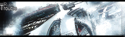
    Not bad. Just work on the text. And add a little more contrast with the sig.

  3. #3

    Default

    k thx m8

  4. #4
    Join Date
    Sep 2006
    Location
    Italy - Milan
    Posts
    314

    Default

    Nice!
    Yes, text could use some work but anyway it is a good looking sign to me. Good job!

  5. #5

    Default

    Good work, although as Showtime said, the text could use work.

  6. #6
    Join Date
    Aug 2006
    Posts
    39

    Cool s3x!!!

    This just doesn't agree with me. Although, It looks sort of nice if I stare at it for longer than 20 seconds >_<; Nice one man, keep em coming

Similar Threads

  1. Grievous Sig
    By Arkanian in forum Sigs & Manips
    Replies: 12
    Last Post: 07-16-2005, 01:54 AM
  2. What im currently working on
    By ZeKayeM in forum Digital Art
    Replies: 10
    Last Post: 05-09-2005, 01:45 AM
  3. Faded.Explosion
    By bsq in forum Digital Art
    Replies: 7
    Last Post: 04-18-2005, 09:53 AM

Posting Permissions

  • You may not post new threads
  • You may not post replies
  • You may not post attachments
  • You may not edit your posts
  •  
Powered by vBadvanced CMPS v4.1.1