0 members and 26,370 guests
No Members online

» Site Navigation

» Stats
Members: 35,442
Threads: 103,075
Posts: 826,688
Top Poster: cc.RadillacVIII (7,429)
|
-
 another halo another halo
comments please!!
v1 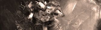
v2 
v3 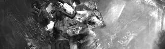
°b A y° - R e c e n t - - F a v -
-
Nice, you are getting good lately, i'd say v1 or v2, text isn't the best thing i'd say remove it or place it in another place/change font.
-
v2 would b the best but the left doesn look gd... and 2 be honest the blending is really shody... sry.
-
i agree with you demon lol thank you guys any more comments?
°b A y° - R e c e n t - - F a v -
-
Looking at it for the second i'd say you could improve the background by overlaying some textures to it and play with a pair of filters to improve the depth of your sign.
Blend the render better, smudge is not the only way to blend renders, for istance, select your render layer and play with the curves to match the background's colours, or use some adjustments, you can easely achieve a better blending even without smudging a single pixel =)
Try something out about that, i'd suggest read a pair of tutorial over here(i did the same thing time ago and they are all very helpful) or on deviant art, some are very professional and easy to understand!
Keep it up!!
-
im new but personally if u hadnt blended the render that much i think it would be alot better v2 imo
-
 yo yo yo yo
I think that this render is over used, but really i cannot really see much out of any of these. I think you over blended.. but thats just my opinion nice try <3
Similar Threads
-
By Otaku10 in forum Digital Art
Replies: 8
Last Post: 08-26-2005, 12:14 PM
-
By -Kanji- in forum Sigs & Manips
Replies: 2
Last Post: 05-01-2005, 10:25 PM
-
By Kritacul in forum Digital Art
Replies: 6
Last Post: 03-16-2005, 01:56 AM
 Posting Permissions
- You may not post new threads
- You may not post replies
- You may not post attachments
- You may not edit your posts
-
Forum Rules
|


 Reply With Quote