GFXVoid Graphic Design Forum

Remove Text Formatting
Loading...

» Online Users: 26,370

0 members and 26,370 guests
No Members online

» Site Navigation

 > FAQ

» Stats

Members: 35,442
Threads: 103,075
Posts: 826,688
Top Poster: cc.RadillacVIII (7,429)
Welcome to our newest member, Lekelindids
Results 1 to 6 of 6

Thread: Kidulthood

  1. #1

    Default Kidulthood

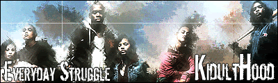
    just whipped this up cuz i was bored C&C plz??

  2. #2
    Join Date
    Jul 2005
    Posts
    4,368

    Default

    not really feeling this one... its lacking in most areas 2 be honest sry.


    Death from above!


    (: PPPPINK!!!!!

  3. #3
    Join Date
    Aug 2005
    Location
    HK
    Posts
    2,353

    Default

    i think the background's boring, nothing much to see really. nice try though.


    <3 Fuzzy

  4. #4
    Join Date
    Oct 2006
    Location
    Canada
    Posts
    141

    Default

    ya not feeling this one either..the filter is alright but text is not good its to plain for me.the line arcross everyone is cool but doesnt fit with the sig. nice try..
    °b A y°
    - R e c e n t -
    - F a v -

  5. #5

    Default

    ok thx anyway wat cud i do to the text to make it stand out more??

  6. #6
    Join Date
    Aug 2005
    Location
    HK
    Posts
    2,353

    Default

    i dunno. i think the text fits, well at least the "everyday struggle" one.
    i'd say scrap this and start a new one, make it look cooler


    <3 Fuzzy

Posting Permissions

  • You may not post new threads
  • You may not post replies
  • You may not post attachments
  • You may not edit your posts
  •  
Powered by vBadvanced CMPS v4.1.1