GFXVoid Graphic Design Forum

Remove Text Formatting
Loading...

» Online Users: 2,464

0 members and 2,464 guests
No Members online

» Site Navigation

 > FAQ

» Stats

Members: 35,442
Threads: 103,075
Posts: 826,688
Top Poster: cc.RadillacVIII (7,429)
Welcome to our newest member, Lekelindids
Results 1 to 6 of 6

Thread: another

  1. #1
    Join Date
    Oct 2006
    Posts
    47

    Default another


  2. #2
    Join Date
    Jul 2005
    Posts
    4,368

    Default

    its not bad at all m8. blending could use some work but thats about it. really like ur current by the way.


    Death from above!


    (: PPPPINK!!!!!

  3. #3
    Join Date
    Oct 2006
    Posts
    47

    Default

    current my normal taste thx for comment

  4. #4
    Join Date
    Apr 2005
    Location
    BAVARIA
    Posts
    362

    Default

    nice one but the face maybe could be blended a bit more.
    greets
    bergi


    I am the master of my soul and i am the master of my faith!

  5. #5
    Join Date
    Aug 2005
    Location
    HK
    Posts
    2,353

    Default

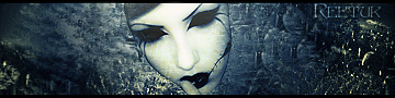
    The black blob on the right needs to go and like the others have said, the render needs to be blended in. Not too sure about the text but everything else is nice. I like the colours, pretty refreshing


    <3 Fuzzy

  6. #6
    Join Date
    Jun 2005
    Location
    New Mexico, USA
    Posts
    292

    Default

    The work that you have done is great so far. It really needs blended, and the colors need some work: the warm skin tones clash with the cool blues of the background.
    Coming Soon


Posting Permissions

  • You may not post new threads
  • You may not post replies
  • You may not post attachments
  • You may not edit your posts
  •  
Powered by vBadvanced CMPS v4.1.1