0 members and 6,691 guests
No Members online

» Site Navigation

» Stats
Members: 35,442
Threads: 103,075
Posts: 826,688
Top Poster: cc.RadillacVIII (7,429)
|
-
 meah? meah?
-
Go with a different text color.
-
-
Not so much liking either of the texts, but damn! if that isn't an absolutely amazing signature!
-
I suck when it comes to text, lols. I'm gonna leave soon, I have to pack soon. Haven't even started yet.. =(
-
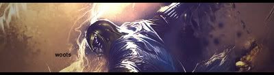
The sig would be more interesting with the render further right. The render seems like the type of render that borders a side... On the other hand, I really dig the right side, too -- so you're in a bit of a pickle.
I don't normally go for the type of text in your second sig, but I think it works really well here.
Interesting sig -- it maintains a single, cool style that you can tell was effectively displayed, and you restrained from using unneccessary techniques/images/styles that would further make your piece incoherent, irrelevant, and messy.
I do have one other complaint though --- it looks like you saved the .jpg on low quality.

 ... With the exception of this stamp.
-
just get rid of the text, btw there is a line on the right side.. sort that out. But overall nice job..
-
pretty cool, you got some good effects and colours goin there nice job
-
v2 is better... and the effects are cool but i think its abit empty.
 Posting Permissions
- You may not post new threads
- You may not post replies
- You may not post attachments
- You may not edit your posts
-
Forum Rules
|


")


 Reply With Quote