0 members and 6,812 guests
No Members online

» Site Navigation
» Stats
Members: 35,442
Threads: 103,075
Posts: 826,688
Top Poster: cc.RadillacVIII (7,429)
|
-
GunZ
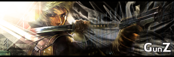
this is a quickie i made...with a style i just developed...

comments please.
P.S. text is suppsed to look like that...so it looks more like the gunz logo
-
haha if thats a quick one, wot the hell do ur 2 long ones look like? lol nice work mate wish i cud do that like
-
my long ones arent as good...lol, usually long because i make a tut on them :P
all my sigs have a tut that describes how to make them.
-
cool, lol, yeh i suck at sigs, prefer makin lp's of cars normally, u got a tut for ur current sig? i like the screws lol, maybe use the same technique on a cars bodykit?
-
screws were easy...make a circle selcetion...fill it with a gradient...then make a bar going through....bevel it in
-
ahh ok thanks, lol, might try and use that if get ambitious, lol, ever try choppin a car in photoshop? Did u use ur own render or was it a file?
-
hmm its alright... the lighting is good... but it lacks flow.
-
thanks sd.....any tips on flow?
-
Well, basically..flow means the movement throughout the signature..having flow would mean the effects, the render etc 'flow' in one direction, making it somewhat more natural i guess.
With your signature though, the focal is the WHOLE canvas, which in design isn't that great..it's good to have center attention on something. To me the text literally stands out too much, and my eyes are drawn to it..plus i don't seem to be liking how you've gone around doing the txt, no offence.
Colours could be better too imo..but it'll all come throughout the learning curve
-
ty, ill try flipping my brushing layer (right side) around...to see if it flows any better
Similar Threads
-
By DinoKind in forum Sigs & Manips
Replies: 4
Last Post: 05-07-2005, 01:54 PM
Posting Permissions
- You may not post new threads
- You may not post replies
- You may not post attachments
- You may not edit your posts
-
Forum Rules
|