0 members and 26,370 guests
No Members online

» Site Navigation

» Stats
Members: 35,442
Threads: 103,075
Posts: 826,688
Top Poster: cc.RadillacVIII (7,429)
|
-
 Recent Tags Recent Tags
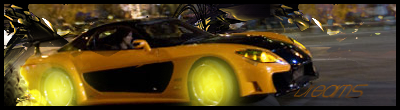
This one i didn't put much effort in to, it was an SOTW entry in the theme of cars, but here it is:
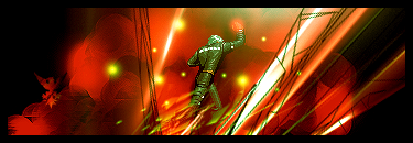
The next two i really like, and are both from plain backgrounds so took a bit of creativity to make:


This one is OK IMO, not much to it but still used a bit of creativity, btw it wasn't all one stock:

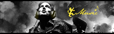
The next two used mostly smudge, the sprite, the BG is smudging and the 'Music' one is all smudging:
CnC on all of em plz guys, and give it a /10 pretty plz
Thx
.heK
-
comeon man... give us a chance lol... anyway...
^hot... love the way she dissolves on the right...^
^great smudging and good blending... text needs alot of work tho... and the yellow looks wrong^
^more good smudging and the c4ds look good in the forground, the colours on the sprite look out of place tho... i think a different sprite would look better^
the rest are alright but all need work... i personaly dislike the kanye one... the blending is non-existant and the bg is meh imo... but mostly they are all ok.
-
Lol ive been getting amazing feedback off my Kanye tag lol
-
random lol... probably just a personal preference thing then lol.
-
^Its ok and the left side is cool, but still kinda meh 6/10
^to be honest not really a fan, kanye sticks out way too much. 7/10
^This one is pretty cool, colours are good but thats one creepy smile.
7.5/10
^Its cool, but you messed up the way the bg should be presented the Vat type things should be sharp and in focus while the building should be blur'd 8/10
^The best one there, great smudging and good text GJ. 9/10
Its kool but lacks the effects on the sprite itself. 7/10
Similar Threads
-
By tacoX in forum Battlegrounds
Replies: 16
Last Post: 09-13-2005, 04:44 PM
-
By dolive in forum Sigs & Manips
Replies: 3
Last Post: 08-27-2005, 10:13 AM
-
By B][G K in forum Digital Art
Replies: 10
Last Post: 04-17-2005, 12:55 AM
 Posting Permissions
- You may not post new threads
- You may not post replies
- You may not post attachments
- You may not edit your posts
-
Forum Rules
|


 Reply With Quote

