GFXVoid Graphic Design Forum

Remove Text Formatting
Loading...

» Online Users: 26,370

0 members and 26,370 guests
No Members online

» Site Navigation

 > FAQ

» Stats

Members: 35,442
Threads: 103,075
Posts: 826,688
Top Poster: cc.RadillacVIII (7,429)
Welcome to our newest member, Lekelindids
Results 1 to 5 of 5
  1. #1
    Join Date
    Jun 2007
    Posts
    325

    Default Smoking...tut tut


  2. #2
    Join Date
    Jul 2005
    Posts
    4,368

    Default

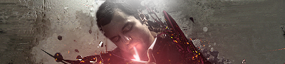
    not to bad. i think the bg needs more colour in it tho... and ur effects are a little concentrated imo. but still hot.


    Death from above!


    (: PPPPINK!!!!!

  3. #3
    Join Date
    Dec 2005
    Location
    Israel
    Posts
    230

    Default

    The background's a little empty, but that could be a could thing since the sig isn't busy and is very focused on the middle. I love the lighter spark effect,


  4. #4
    Join Date
    Jul 2005
    Posts
    102

    Default

    I like it, but i think there needs to be more contrast on the stock imo..it needs something that brings it out a lil more anyway.

    ^_^


  5. #5
    Join Date
    Jun 2007
    Posts
    325

    Default

    Cheers for the comments.

Similar Threads

  1. My comic for an english project
    By billabong7329 in forum Digital Art
    Replies: 6
    Last Post: 04-15-2005, 03:44 PM

Posting Permissions

  • You may not post new threads
  • You may not post replies
  • You may not post attachments
  • You may not edit your posts
  •  
Powered by vBadvanced CMPS v4.1.1