GFXVoid Graphic Design Forum

Remove Text Formatting
Loading...

» Online Users: 11,572

0 members and 11,572 guests
No Members online

» Site Navigation

 > FAQ

» Stats

Members: 35,442
Threads: 103,075
Posts: 826,688
Top Poster: cc.RadillacVIII (7,429)
Welcome to our newest member, Lekelindids
Results 1 to 8 of 8

Thread: wtf? more? lol

  1. #1
    Join Date
    Jul 2005
    Posts
    4,368

    Default wtf? more? lol


    what you all think?


    Death from above!


    (: PPPPINK!!!!!

  2. #2

    Default

    lots of bg color
    i think you could do a little more with the text though

  3. #3
    Join Date
    Sep 2005
    Posts
    168

    Default

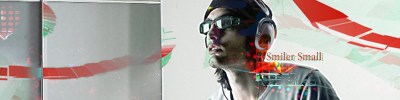
    haha, i love the first one. its very funkalicious. The third one has nice colors n fx in the bg, but idk if i like the head just floating there. Also, might i suggest that you try another style to break the trend? All of your latest sigs look the same lol.

  4. #4
    Join Date
    Jul 2005
    Posts
    4,368

    Default

    thanks man.


    Death from above!


    (: PPPPINK!!!!!

  5. #5
    Join Date
    Aug 2007
    Location
    Kemnay, Scotland ...the best place in the world!
    Posts
    268

    Default

    the third ones the best, the 1sts txt doesn't look good imo! but good work alltogether
    Latest
    -------


    -------


  6. #6

    Default

    I like the sigs.


    There's nothing wrong with the text, it's just unnecessary and distracting.


    ... With the exception of this stamp.

  7. #7
    Join Date
    Jun 2007
    Posts
    325

    Default

    First is meh, but the second is head and shoulders above the rest, pun intended, i love the text and the yellow rock.

  8. #8
    Join Date
    Jul 2005
    Posts
    4,368

    Default

    thbx guys


    Death from above!


    (: PPPPINK!!!!!

Posting Permissions

  • You may not post new threads
  • You may not post replies
  • You may not post attachments
  • You may not edit your posts
  •  
Powered by vBadvanced CMPS v4.1.1