0 members and 469 guests
No Members online

» Site Navigation

» Stats
Members: 35,442
Threads: 103,075
Posts: 826,688
Top Poster: cc.RadillacVIII (7,429)
|
-
 First sig in a while First sig in a while
Ok, I did this in about 2hours and its been quite sometime since I did a sig so be nice.
I want your comments and criticisms cause I want to make better sigs in the future. 
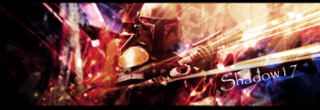
The left seems like it could do with something, but I don't know what....
Last edited by TM17; 07-02-2008 at 09:57 AM.
-
first of all there is a lack of depth in there, erase the effects over the render. and hit us with an update.
-

This is what I started with.
-
 Originally Posted by TM17

I want your comments and criticisms cause I want to make better sigs in the future.
I'm glad because without your motivation these comments are fruitless.
The first thing i saw when i noticed this was quality. the quality on this is HORRIBLE :P. The only time (I can think of) That you wanna use GIF is when you are having an animation. Other than that you either wanna use Jpeg (with 100% quality) or PNG (mainly for transparency).
Second of all there seems to be a lot going on in this sig. Which can be good: it provides for good blending, a lot too look at and nice effects. However this is getting almost too chaotic. and a classic way to make it less chaotic is to minimize the color a bit more. Use gradient maps with blending options (such as Hue and soft light) set to low opacities (5-20%), you can also use photofilters and color balances to help make the colors more..unified and together rather than jumbled.
Another way to help out with the making more unified but less chaotic thing, is to do the following:
1. New layer
2. Image> Aplply Image
3. DUplicate it
Name on sharpen and one blur
4. On the blur one go Filter> blur> blur more and mask out or erase all of the sig except the edges (using a soft big low opacity brush)
5. On the sharpen one: Filter>sharpen> sharpen then mask out everything except the render and SOME (very little) effects.
This will add depth make your focal stand out more, and overall unify your sig more as well.
Finally text wise:
I realize this is a default font. However Using default fonts isn't as easy as people take it to be. You must use fonts that LOOK deafault as well. Fonts liek arial, veranda, tahoma, Eurose, most sans serif fonts.
Placement is alright though and coloring is okay as well. However i suggest you read:
Dark Method's Text guide
It will make you much more confident in your text.
Also if you haven't tried it the filter Topaz is pretty nice. You might want to try it. There is a 30 day free trial if you google it. It works pretty niceley for sealing up sigs and making them look..unified.
Remember to only use it at the end of the sig though, and use the sharpening and blurring right before it, but still at the end.
 My DevART
RATCHET is my bitch
Andrew says:
u ever stolen a bible?
Apathy says:
no
used the last two pages to roll a joint though
Andrew says:
wow
thats fucking hard core
^^HAHAHA, dm sucks XD
-
Originally Posted by TM17
This is what I started with.
Was it a render? Or a stock with a white BG?
I've seen it in render form before, you might wanna consider using it cut-out if you aren't already.
My DevART
RATCHET is my bitch
Andrew says:
u ever stolen a bible?
Apathy says:
no
used the last two pages to roll a joint though
Andrew says:
wow
thats fucking hard core
^^HAHAHA, dm sucks XD
-
Originally Posted by Papa
Was it a render? Or a stock with a white BG?
I've seen it in render form before, you might wanna consider using it cut-out if you aren't already.
Yeah, I used the render from planet renders
 Posting Permissions
- You may not post new threads
- You may not post replies
- You may not post attachments
- You may not edit your posts
-
Forum Rules
|


 Reply With Quote


