0 members and 26,370 guests
No Members online

» Site Navigation
» Stats
Members: 35,442
Threads: 103,075
Posts: 826,688
Top Poster: cc.RadillacVIII (7,429)
|
-
Just got back =)
As you can see, I've been here for 3 years and only something like 8 posts =o.
Anyways I took a break but I found my photoshop cs2 and decided to make something, this is what I came up with.

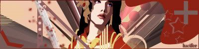
This is some old stuff


CnC is definatly welcome =P.
Ps. I know the text on all is complete crap, I was never one to worry about it though =P
-
I actually like the new one for some reason, is simple but effective, good work on the blending and the text seems to fit pretty well, good work.
-
-
I think its to bright, that stroke under the text i see no reason for that to be there. It is a bit simple bu its a decent job. Hit us with more
-
yea, pretty bright, but that seems to be your style by the looks of your previous works.
Kind of grainy looking too, especially over the render.
and yea, text needs work.
-
LOL I just realized why your saying its so bright, I have my profile for my vid card settings gamma on kinda low so that I can play Counter-Strike: 1.6. On my screen the sig looks kinda darker =P
Similar Threads
-
By Graffight in forum Sigs & Manips
Replies: 3
Last Post: 04-14-2007, 05:14 AM
-
By Hominid in forum Introductions
Replies: 2
Last Post: 03-09-2007, 10:07 PM
-
By Delphic in forum Introductions
Replies: 1
Last Post: 08-03-2005, 01:54 PM
-
By sKe7ch in forum Introductions
Replies: 7
Last Post: 04-17-2005, 10:22 AM
-
By Scandium in forum Introductions
Replies: 4
Last Post: 04-17-2005, 02:10 AM
Posting Permissions
- You may not post new threads
- You may not post replies
- You may not post attachments
- You may not edit your posts
-
Forum Rules
|