0 members and 726 guests
No Members online

» Site Navigation
» Stats
Members: 35,442
Threads: 103,075
Posts: 826,688
Top Poster: cc.RadillacVIII (7,429)
|
-
-
its to contrasted by his face and around him should try to bring more of that green in there makes it intresting
-
Agreed-There's not much detail, it's a poor stock from a poor game 
Try liven it up a bit more.
 
Religion gives nothing in life, only in death.
-
Wow that is a big accusation to say about CoD4.
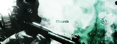
Anyways as for the sig, it is very had to see the deatil in the render, and the bg doesn't really fit it all that well, I would say put the render in the middle and use some clipping masks to liven it up. It is ok though, nice try Church.
-
I like the right side a lot. That part of the BG is pretty cool and looks really war like and eroded to me. But I must agree aside form that it looks very blown out And over contrasted.
If you can tone it down a bit it'd be multitudes better.
My DevART
RATCHET is my bitch
Andrew says:
u ever stolen a bible?
Apathy says:
no
used the last two pages to roll a joint though
Andrew says:
wow
thats fucking hard core
^^HAHAHA, dm sucks XD
Similar Threads
-
By Churchİ in forum Sigs & Manips
Replies: 3
Last Post: 06-21-2008, 01:34 AM
-
By Heron in forum The Void
Replies: 23
Last Post: 02-03-2006, 12:25 PM
-
By S-Gen. in forum The Void
Replies: 14
Last Post: 12-24-2005, 10:22 PM
-
By Zeyne in forum Sigs & Manips
Replies: 8
Last Post: 11-30-2005, 02:48 PM
-
By *Peng* in forum The Void
Replies: 5
Last Post: 11-08-2005, 11:48 AM
Posting Permissions
- You may not post new threads
- You may not post replies
- You may not post attachments
- You may not edit your posts
-
Forum Rules
|