0 members and 3,956 guests
No Members online

» Site Navigation

» Stats
Members: 35,442
Threads: 103,075
Posts: 826,688
Top Poster: cc.RadillacVIII (7,429)
|
-
 Omg ratchet did a vector? Omg ratchet did a vector?
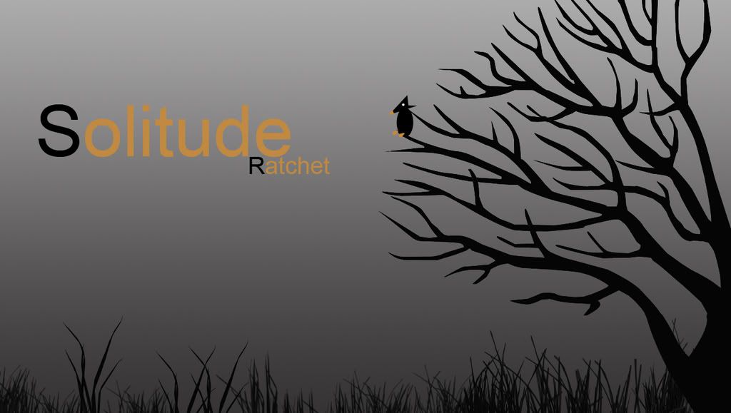
Vectored the tree and the bird. Grass was a brush(it would of killed me to vector that.)
Yeah it's simple but that add to the charm right? 
-
Saw this on dA, think it's pretty cool. The grass is great. I think the orange on the text spoils it a bit, but a good start. 
   Religion gives nothing in life, only in death.
-
Lawl looking great ratchet really mysterious looking
Lova ya;*XD
-
I like it.
Nice job.
I like the text too 
-
I'm not a fan of quick work
-
 Originally Posted by Rai

I'm not a fan of quick work
owned.
pretty much for a first vector it has some decent shapes, i honestly havnt tried enoguh to be able to get that done, its meh. but you probably know that aswell.
-
Originally Posted by Rai
I'm not a fan of quick work
How the hell did you become a staff?
Your rude and always point out bad stuff in peoples work without saying how do improve. Did you even read the critique rules?
-
You didn't get my point did you. I consider myself rather honest than rude..
What I was trying to say was, you're work needs more detail. Everyone knows how to download a brush and work their way around, and as for the stuff you made, call me rude but I think it's somewhat pathetic. What happened to our members that would spend hours on their art? This is quick work, and you know how to improve it yourself, take the time and get on it.
-
Originally Posted by Rai
You didn't get my point did you. I consider myself rather honest than rude..
What I was trying to say was, you're work needs more detail. Everyone knows how to download a brush and work their way around, and as for the stuff you made, call me rude but I think it's somewhat pathetic. What happened to our members that would spend hours on their art? This is quick work, and you know how to improve it yourself, take the time and get on it.
Well aside from spending more time on it. How do you suggest he make it better rather than saying it looks pathetic. Because, Rai, Everyone's gotta start somewhere. Whether it be here at the void or at their highschool graphic design class, I don't know, but that's what the void is for. GIVING HELPFUL CNC THAT WILL FURTHER THEIR GFX ABILITIES.
That being said your CNC is pathetic.
Ratchet I thing you should try too add some highlights and shadows ont he tree to make it look better. Also if you give the bird some more shape it might look a bit better. Aside fromt hat the orange letters seem odd to me.
 My DevART
RATCHET is my bitch
Andrew says:
u ever stolen a bible?
Apathy says:
no
used the last two pages to roll a joint though
Andrew says:
wow
thats fucking hard core
^^HAHAHA, dm sucks XD
-
I also do like this. but feel the orange text is just too off set, doesn't match.
Similar Threads
-
By ratchetnclank in forum Sigs & Manips
Replies: 7
Last Post: 07-04-2008, 08:40 AM
-
By Marrklarr in forum Digital Art
Replies: 8
Last Post: 07-03-2005, 03:39 PM
-
By DragonsRage in forum The Void
Replies: 2
Last Post: 06-04-2005, 09:09 PM
-
By DragonsRage in forum Sigs & Manips
Replies: 9
Last Post: 05-23-2005, 10:48 PM
-
By DragonsRage in forum Sigs & Manips
Replies: 9
Last Post: 04-20-2005, 05:13 AM
 Posting Permissions
- You may not post new threads
- You may not post replies
- You may not post attachments
- You may not edit your posts
-
Forum Rules
|


 Reply With Quote


