0 members and 836 guests
No Members online

» Site Navigation

» Stats
Members: 35,442
Threads: 103,075
Posts: 826,688
Top Poster: cc.RadillacVIII (7,429)
|
-
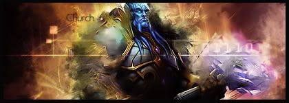
 Halo 3 Sig. Halo 3 Sig.
I think I did a really good job on this one so point out my flaws please.

-
i think the render need to stand out a lil more and needs more flow but otherwise it looks good 
thats my opinion but im noob sig maker

 Originally Posted by Jeff
I have a question. who fucking cares?
^^what a nice mod
-
Has nice colors and looks like it has decent blending
Also thats Halo Wars
Thanks Fire
-
Good blending. IMO it's a bit too dark, and saturated. I would try to tone both of them down so you can spot the render a bit more.
COol effects and blending. You might want to add a light source to the sig to brighten it up.
The text is good, I like how you used the halo text XD.
I would just make it a bit smaller.
Overall not bad.
 My DevART
RATCHET is my bitch
Andrew says:
u ever stolen a bible?
Apathy says:
no
used the last two pages to roll a joint though
Andrew says:
wow
thats fucking hard core
^^HAHAHA, dm sucks XD
-
Thanks for the tips guys... I did make a light source by the way. It's to the right of his head. And how did you know that it was Halo Wars, Church?
Also agree that it's a bit too hard to even notice the render... Thanks for the input guys.
-
u can tell its halo wars by the quality of it
Originally Posted by Jeff
I have a question. who fucking cares?
^^what a nice mod
Similar Threads
-
By Papa in forum Sigs & Manips
Replies: 5
Last Post: 07-21-2007, 06:36 PM
-
By nVision in forum Sigs & Manips
Replies: 11
Last Post: 01-26-2007, 08:57 PM
-
By neogfx in forum Sigs & Manips
Replies: 1
Last Post: 11-16-2006, 01:28 PM
-
By Blitz in forum Sigs & Manips
Replies: 2
Last Post: 09-10-2006, 01:14 PM
-
By danielsaso in forum Sigs & Manips
Replies: 2
Last Post: 08-08-2006, 01:41 PM
 Posting Permissions
- You may not post new threads
- You may not post replies
- You may not post attachments
- You may not edit your posts
-
Forum Rules
|


 Reply With Quote

