0.o ok im not going to lie
i freaking love this 1
atleast for now i do
i got an idea while doing a request for a friends site
anyways thats not important
but while making a banner and a logo for him
i got a great idea
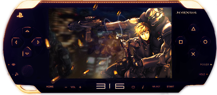
and here it is
enjoy
here is the original pic
and the original other pic
idk mind if you use the materials i used
but just wanted to show i made it basically from scratch
enjoy and CnC plz


 Reply With Quote