GFXVoid Graphic Design Forum

Remove Text Formatting
Loading...

» Online Users: 1,789

0 members and 1,789 guests
No Members online

» Site Navigation

 > FAQ

» Stats

Members: 35,442
Threads: 103,075
Posts: 826,688
Top Poster: cc.RadillacVIII (7,429)
Welcome to our newest member, Lekelindids
Results 1 to 5 of 5

Thread: My Website Temp

  1. #1
    Join Date
    May 2008
    Posts
    108

    Default My Website Temp

    Ok well i have no idea about making websites fully ... just buttons and banners and navi buttons and now it's the summer holidays .... so i won't find out at school for a while so i have no clue how to make this Temp into my website i've only used Dream weaver to make a website.

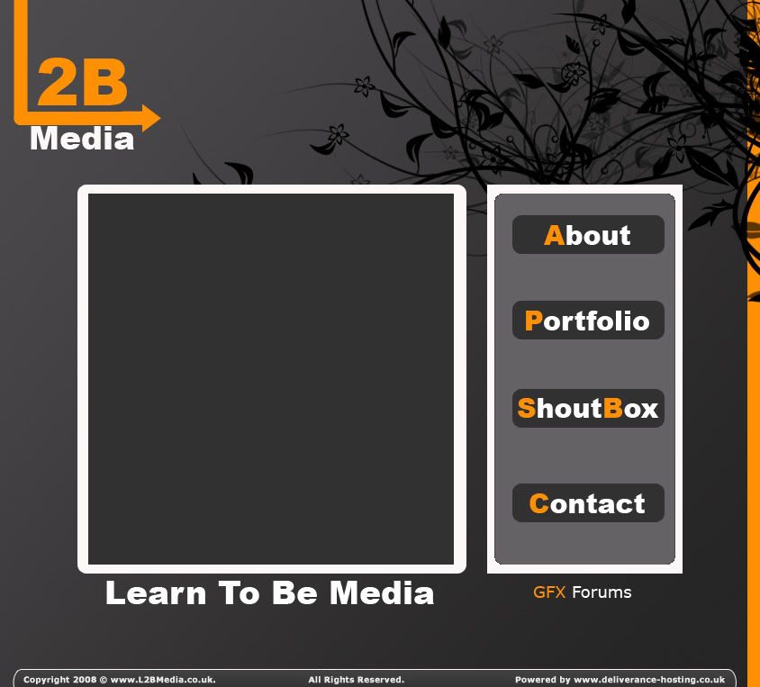
    So give me some tips XD but the anoying thing was on the Squares with curved corner the Grey one looks a bit wird .... dunno how to fix it. i know you have to slice it but dunno what to do after that

    DELETE THIS ACCOUNT PLEASE DO NOT USE IT ANY MOAR

  2. #2
    Join Date
    May 2008
    Posts
    108

    Default

    Edit: Nvm i have worked it all out websites now up at www.L2BMedia.co.uk


    EDIT2: XD well i need someone help so if you know quite a bit about Photoshop and dreamweaver please add me on MSN Meh-Bulman@hotmail.co.uk
    Last edited by \/\/AЯ|\|!|\|G; 08-04-2008 at 05:40 PM.
    DELETE THIS ACCOUNT PLEASE DO NOT USE IT ANY MOAR

  3. #3
    Join Date
    Jan 2007
    Location
    Minnesota
    Posts
    5,091

    Default

    It's pretty simple. IMO the grass brushing doesn't work at all. Its too chaotic for such a simple design.
    The orange bar is pretty distracting. it draws my eye to the edge of the page rather than to the content so it doesn't really make sense for it to be there.

    When designing templates it helps to use Lorem Ipsum on your templates:
    Lipsum.com you can get generated lorem ipsum there.

    It's used so that it portrays what the content will look like, without having the viewer start to read it.
    I'd say just practice more. Its where you get your skillzzzz. XD


    My DevART
    RATCHET is my bitch
    Andrew says:
    u ever stolen a bible?
    Apathy says:
    no
    used the last two pages to roll a joint though
    Andrew says:
    wow
    thats fucking hard core
    ^^HAHAHA, dm sucks XD


  4. #4
    Join Date
    May 2008
    Posts
    108

    Default

    Cheers papa your advise always help
    DELETE THIS ACCOUNT PLEASE DO NOT USE IT ANY MOAR

  5. #5
    Join Date
    Dec 2006
    Posts
    702

    Default

    orange in the top corner pulls away
    the grass doesn't really match the simplicity
    imo too round overall imo
    Typography has to be worked on (ain't doin it for me overall)
    the color scheme is too dark/not contrasted enough

    Try something a bit less modular (ie more something that could stretch on forever)

    My tip: go out and look at web pages, and copy what you like about them Practice makes perfect!

    -kon

Similar Threads

  1. recent temp.
    By Papa in forum Digital Art
    Replies: 7
    Last Post: 07-01-2008, 02:49 PM
  2. new portfolio temp
    By DesiTitan in forum Digital Art
    Replies: 4
    Last Post: 05-04-2007, 04:08 AM
  3. Site temp
    By Henry in forum Digital Art
    Replies: 26
    Last Post: 01-09-2007, 11:16 PM
  4. 2nd temp.
    By Adam in forum Digital Art
    Replies: 5
    Last Post: 01-22-2006, 12:14 AM
  5. Fist Try at a temp.
    By Ivo in forum Digital Art
    Replies: 2
    Last Post: 06-19-2005, 09:23 PM

Posting Permissions

  • You may not post new threads
  • You may not post replies
  • You may not post attachments
  • You may not edit your posts
  •  
Powered by vBadvanced CMPS v4.1.1