0 members and 754 guests
No Members online

» Site Navigation

» Stats
Members: 35,442
Threads: 103,075
Posts: 826,688
Top Poster: cc.RadillacVIII (7,429)
|
-
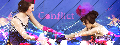
 Conflict. Conflict.
Foir another SoTW, not to keen on the text, I think it could of been incorporated better instead of just being stuck there. I'll probably change it once the contest is over.
-
hmmm the effects are nice, but IMO the text kills it man, it draws away from the focal. maybe try a diff version with diff text?
-
I think the text only kills it where it is now. If you place it behind one of the focuses, so it looks like a part of the background, and lower the opacity, it'll make it a bit better. 
   Religion gives nothing in life, only in death.
-
Hmm i like the style but like every1 else the text spoils it for me but otherwise GJ
Dan.
-
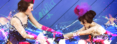
Changed the text, still not sure on it though.
-
txt is better in the v2 version
mabe do the txt but make a clipping mask and lower the opasity IMO
-
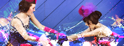
The original one got me placed 
3rd, but I still got placed
Similar Threads
-
By Bergi in forum Digital Art
Replies: 4
Last Post: 11-08-2005, 05:27 PM
-
By Conflict39 in forum Introductions
Replies: 2
Last Post: 08-27-2005, 08:18 AM
-
By Airisus in forum Digital Art
Replies: 6
Last Post: 08-25-2005, 09:59 AM
-
By robgasm in forum Digital Art
Replies: 2
Last Post: 07-24-2005, 11:47 AM
-
By robgasm in forum Digital Art
Replies: 10
Last Post: 07-08-2005, 03:29 AM
 Posting Permissions
- You may not post new threads
- You may not post replies
- You may not post attachments
- You may not edit your posts
-
Forum Rules
|


 Reply With Quote


