0 members and 628 guests
No Members online

» Site Navigation

» Stats
Members: 35,442
Threads: 103,075
Posts: 826,688
Top Poster: cc.RadillacVIII (7,429)
|
-
-

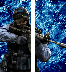
I dont get it. It has a good bg and render. The render needs to be blended. But whats with the tall sigs?
-
trust me when i say the render DIDNT look good blended o_o
-
Well it donsn't look good not blended. Maybe use a different render?
-
uhh idk what you ment by that, but anyways. decent i guess, and people, please STOP grading sigs by the fucking size, im sorry but this pisses me off to an extreme, i know that its not good to have tall sigs, but plz as long as people arent using thme, dont let that sway what you say! i see too many people comment on a sig like this:
"its ok, but why is it so big?"
or
"decent, but fix the size"
now you can comment on it, but if its your only freaking comment, i mean give me a break!! sorry but this pisses me off to an extreme like i said before. ok, back on topic.
pretty nice, nice brushing, i like the text, blend the render a little bit, but you dont have to if thats not what your goin for, looks fine as it is. my only question is, why did you split it in two? you may have seen multi paneled sigs on other sites, but there the point of it is smaller size, bcuz they are actually 3 images that they put spaces in between. here its all one pic so i dont get the point :blink:
If you want help...
Screw you
If you make sigs...
Screw you
-
i was just experimenting with different things
-
thats cool, i donthave anything against it, i was just curious.
If you want help...
Screw you
If you make sigs...
Screw you
-
I didn't grad on the size..i just wanted to know why the size. I still think you should blend the render...maybe show us what it looks like blended?
-
That looks like you just cut part of it out and split it in half..everything matches up..and..yes it WOULD look good blended..I can do it if you want me to..you might not of done it the right way..
PS:.. Try and find more brushes..you used the same ones as in your current sig..
-
I love the bg..but like every1 else...its the render =/...u should blend it..
Show us how does the render looks when its blended plz 
Similar Threads
-
By Bradley in forum Sigs & Manips
Replies: 6
Last Post: 06-08-2005, 01:13 PM
 Posting Permissions
- You may not post new threads
- You may not post replies
- You may not post attachments
- You may not edit your posts
-
Forum Rules
|


 Reply With Quote


