GFXVoid Graphic Design Forum

Remove Text Formatting
Loading...

» Online Users: 5,701

0 members and 5,701 guests
No Members online

» Site Navigation

 > FAQ

» Stats

Members: 35,442
Threads: 103,075
Posts: 826,688
Top Poster: cc.RadillacVIII (7,429)
Welcome to our newest member, Lekelindids
Results 1 to 7 of 7
  1. #1

    Default Realm of the Dead

    Just remade it with dif. colors...
    Original:


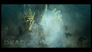
    New Colors and lighting:

    no text either =P

    is it any better?

  2. #2
    Join Date
    Apr 2007
    Location
    UK
    Posts
    484

    Default

    i think the blend and depth on number two is better than 1 but i dunno there's just something about 1 which appeals but overall 2 is better (imho)


    [((_CRAYOLA_((]>[((_CRAYOLA_((]>[((_CRAYOLA_((]>[((_CRAYOLA_((]>[((_CRAYOLA_((]>[((_CRAYOLA_((]>

  3. #3
    Join Date
    May 2008
    Posts
    432

    Default

    I wouldn't say it's better it's just...different. Both look good though.
    .:Some of My Best:.

  4. #4
    Join Date
    Jun 2008
    Location
    FL
    Posts
    121

    Default

    in terms of just colors and such id say #2 is better... but the blue/green color in #1 fits better w/ "DEAD" and the render simply because it gives more of a death aura i think... so id think #1 is better
    Newest

  5. #5
    Join Date
    Jan 2007
    Location
    Minnesota
    Posts
    5,091

    Default

    Blending is great. Looks realy ghastly good job with that.
    V1 is my favorite. Cool text


    My DevART
    RATCHET is my bitch
    Andrew says:
    u ever stolen a bible?
    Apathy says:
    no
    used the last two pages to roll a joint though
    Andrew says:
    wow
    thats fucking hard core
    ^^HAHAHA, dm sucks XD


  6. #6
    Join Date
    Feb 2008
    Location
    Toronto, Canada
    Posts
    4,831

    Default

    i've always digged those purpley colours on v2 so i like that one. maybe some text and then it'd be great.


  7. #7
    Join Date
    Feb 2007
    Posts
    49

    Default

    Not really liking the size, but a pretty good job. Sharpen up the focal a bit, itll stand out more if you know what i mean.

Similar Threads

  1. another realm
    By roofus in forum Digital Art
    Replies: 2
    Last Post: 05-16-2006, 03:49 PM
  2. Oh come on i could have been dead
    By Deadloader in forum The Void
    Replies: 4
    Last Post: 12-30-2005, 11:07 PM
  3. YOUR ALL DEAD!
    By Elleray in forum Sigs & Manips
    Replies: 8
    Last Post: 10-24-2005, 10:10 AM
  4. Dead man
    By Progz in forum Digital Art
    Replies: 3
    Last Post: 09-06-2005, 03:13 PM
  5. dead end
    By arson™ in forum Digital Art
    Replies: 3
    Last Post: 09-04-2005, 05:50 AM

Posting Permissions

  • You may not post new threads
  • You may not post replies
  • You may not post attachments
  • You may not edit your posts
  •  
Powered by vBadvanced CMPS v4.1.1