0 members and 18,474 guests
No Members online

» Site Navigation

» Stats
Members: 35,442
Threads: 103,075
Posts: 826,688
Top Poster: cc.RadillacVIII (7,429)
|
-
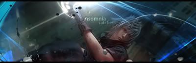
 Insomia. Insomia.
V2:
V3:
V4:
Bit different yas?
Last edited by ratchetnclank; 08-13-2008 at 03:35 AM.
-
This is interesting, I like it. v1, imo. The only thing I didnt like about this one was the black splatter on the blue thing in the top left corner.
These machines feed off the tears, of broken lives and dying dreams. - Rise against.
-
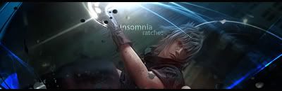
it's interesting, but try lightening some of the center area, so that ball of light brightens a wider area. as in, give the left side of his face + hair (our left, his right) the same effect as seen on the arm... if that makes sense. you'd have to be careful though, as not all of that side of his face would be brighter, since some is covered by the hair.
-
 Originally Posted by Jeff

it's interesting, but try lightening some of the center area, so that ball of light brightens a wider area. as in, give the left side of his face + hair (our left, his right) the same effect as seen on the arm... if that makes sense. you'd have to be careful though, as not all of that side of his face would be brighter, since some is covered by the hair.
k i'll hit you with another version soon.
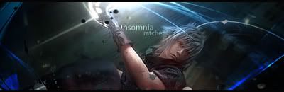
V3:
Lighting on face any better?
Last edited by ratchetnclank; 08-12-2008 at 02:58 PM.
-
better, but i think it could be still more intense--about as bright as the arm gets.
-
This looks slick dude
Nice effects. And lightning on face much better.
A>lthough the clipping mask thats on his upper arm could be removed. a bit distracting.
Lovely job
-
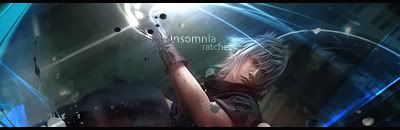
Well that's an interesting angle 
Pretty cool though, I'd like a cross of what Jeff said with a little stronger facial lighting and what you have on the left of v1.
-
v3 ftw.
props for trying something new.
yeah the splatter by the top left is a bit distracting but other than that nice work. keep it up.
-
Originally Posted by Studhorse
Well that's an interesting angle
Pretty cool though, I'd like a cross of what Jeff said with a little stronger facial lighting and what you have on the left of v1.
Done
 Posting Permissions
- You may not post new threads
- You may not post replies
- You may not post attachments
- You may not edit your posts
-
Forum Rules
|


 Reply With Quote


