0 members and 3,585 guests
No Members online

» Site Navigation

» Stats
Members: 35,442
Threads: 103,075
Posts: 826,688
Top Poster: cc.RadillacVIII (7,429)
|
-
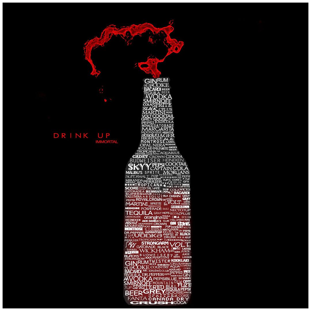
 Drink Up Drink Up
My entry for the teams contest. the typography oneXD.
my first shot at typography.
hows it look?
Last edited by Immortal.; 08-15-2008 at 09:52 AM.
-
OMG.
looks awesome Immortal. ;]
but text "Drink Up Immortal" could use some work IMO.
-
Immortal, This is GREAT! The top of it looks awesome liek you just popped the cap on a soda bottle.
The typography looks great too man, you did awesome on that.
Though i can't say it's SUPER original, I've seen the idea of this many times on devart, but it looks really nice and you did a good job.
 My DevART
RATCHET is my bitch
Andrew says:
u ever stolen a bible?
Apathy says:
no
used the last two pages to roll a joint though
Andrew says:
wow
thats fucking hard core
^^HAHAHA, dm sucks XD
-
lol thnx alot gar..my first shot i dreamt it up yesterdai night.
what do u suggest i change the text around to?
-
lol thnx papa, thnx. i guess this idea's bin around.
but that's okay. i like how i did. i'm quite satisfied.
-
Yea, I'm sure it's been done before, but it still looks cool 
-
It looks okay, im not a fan of typographic. But it looks interesting but the main text need a bit of work.
-
Must of taken ages. Good job immortal.
-
damn right it took ages....lol
took pretty long i tell u.
-
I think you should leave the gray+glowy red out and change the font colours instead.
Similar Threads
-
By 7:20 in forum The Void
Replies: 13
Last Post: 04-12-2006, 10:18 AM
-
By *Peng* in forum Digital Art
Replies: 6
Last Post: 01-26-2006, 03:39 PM
-
By villian in forum The Void
Replies: 8
Last Post: 07-24-2005, 01:45 AM
-
By EMPeiTQ in forum The Void
Replies: 11
Last Post: 07-20-2005, 01:07 AM
 Posting Permissions
- You may not post new threads
- You may not post replies
- You may not post attachments
- You may not edit your posts
-
Forum Rules
|


 Reply With Quote


