0 members and 5,020 guests
No Members online

» Site Navigation

» Stats
Members: 35,442
Threads: 103,075
Posts: 826,688
Top Poster: cc.RadillacVIII (7,429)
|
-
 Newest. Newest.
V.1
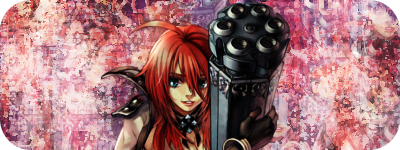
V.2

V.3

V.4
V.5

V.6

V.7

V.8
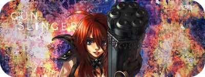
V.7 is voted best on another forum I agree because I'm to lazy to incorperate text on V.8 (-_________-)
EDIT:
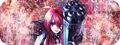
V.9

Last edited by Lauren; 08-23-2008 at 07:50 AM.
-
Uhm, your latest one (the one down at the signature spot) is really awesome, but.. the one that you posted here now.. Idk.. I really dont like the colors that much, and as it goes for the render, maybe some more blending?
Latest:

-
I thought that was why it looked a little off. But I cannot blend for my life xD
And, 
-
It defintletly needs more blending. Try smudging over the render a bit, and painting a bit it always helps for blending.
The smudging seems to be going in no direction of flow..There is no flow. You should probabaly fix that right now it looks kind of plain and I'm just not feelin it. The smdudgin looks okay, I'm not a giant fan of the texture but it's alright.
Color wise theres soo much going on. I think your last is probabaly your best but i would try limiting the color a bit more.
Compositionally you should read up on the rule of thirds. It's not very appealing at all to have the render smack in the middle like that, I realize composition hardly matters in sigs because they are so...quick and not very serious however you shouldn't have the renders face in the middle of the sig vertically either.
The text is not working, There really isn't a spot for it in this sig since the smdugin is so everywhere.
Work on your flow and your smudging. try to make it flow towards the focal more.
 My DevART
RATCHET is my bitch
Andrew says:
u ever stolen a bible?
Apathy says:
no
used the last two pages to roll a joint though
Andrew says:
wow
thats fucking hard core
^^HAHAHA, dm sucks XD
-
yeah without flow a sig is just a bg and something pasted on.
u should really try to bring some flow into the sig. and smudge it like papa said.
still i like the colours a bit, just alot in the bg.
i like v7.
nice stuff...and keep it up man.
Similar Threads
-
By asdio in forum Sigs & Manips
Replies: 5
Last Post: 04-19-2008, 11:56 AM
-
By Graffight in forum Sigs & Manips
Replies: 11
Last Post: 01-27-2007, 11:46 PM
-
By blindman4556 in forum Sigs & Manips
Replies: 5
Last Post: 01-21-2007, 11:59 AM
-
By Riddleb0x in forum Sigs & Manips
Replies: 2
Last Post: 01-19-2007, 03:12 PM
-
By konfusion in forum Sigs & Manips
Replies: 3
Last Post: 01-11-2007, 10:23 PM
 Posting Permissions
- You may not post new threads
- You may not post replies
- You may not post attachments
- You may not edit your posts
-
Forum Rules
|


 Reply With Quote


