0 members and 9,288 guests
No Members online

» Site Navigation

» Stats
Members: 35,442
Threads: 103,075
Posts: 826,688
Top Poster: cc.RadillacVIII (7,429)
|
-
-

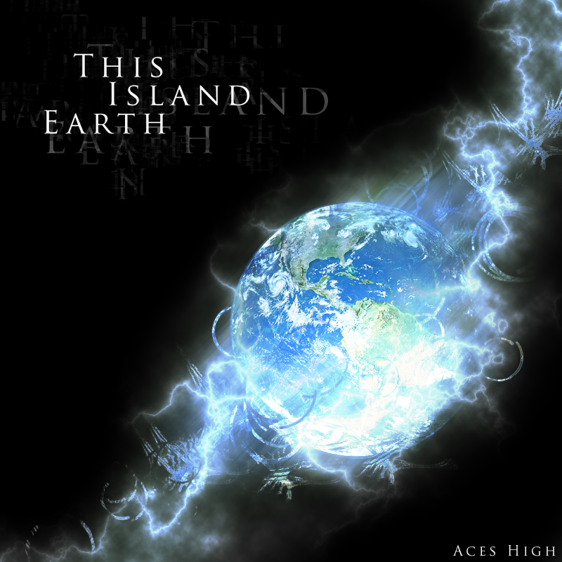
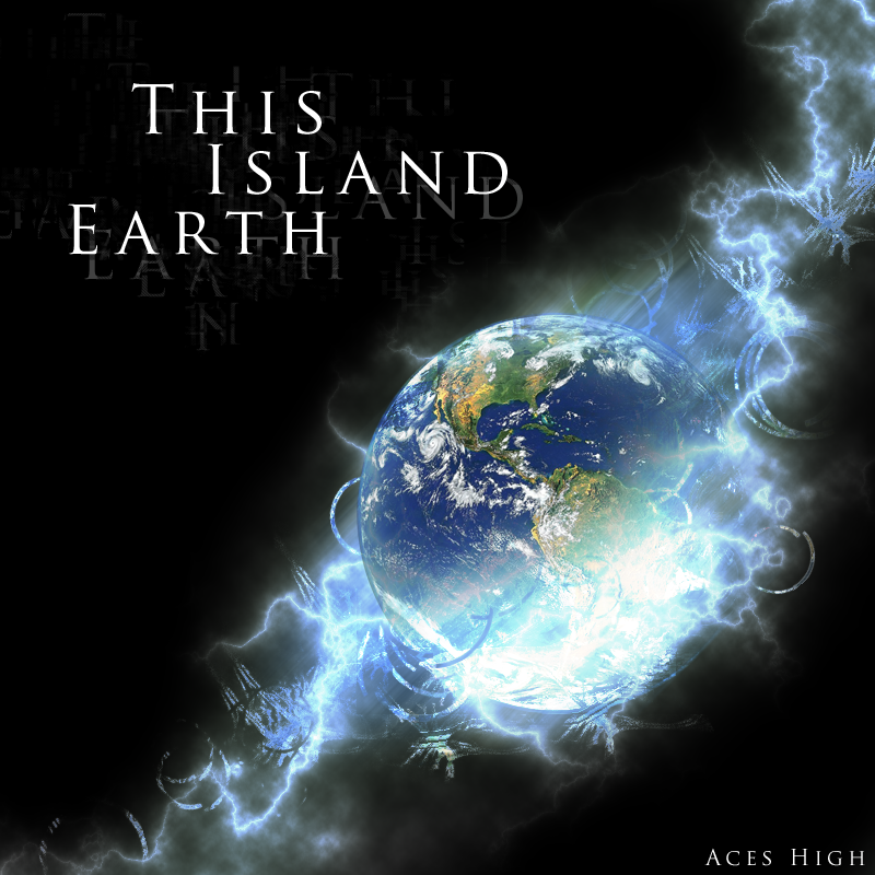
nice stuff. just motion blur are little too strong for me. maybe lower the opacity?
-
The motion blur is nice IMO.
The text needs to be changed tho IMO.
But really nice work
-
 Originally Posted by silentshadow

The motion blur is nice IMO.
Matter Of taste 
-
the glow below the planet is cool. you've got some ncie effects going. I think the motion blur is fine. The text, though it's a bit big it's still pretty nice. I like this aces.
 My DevART
RATCHET is my bitch
Andrew says:
u ever stolen a bible?
Apathy says:
no
used the last two pages to roll a joint though
Andrew says:
wow
thats fucking hard core
^^HAHAHA, dm sucks XD
-
Don't like the text too much, too harsh / boring.
And also - The colouring on the earth would look better if you made it black and white ( or 50% b&w ) then added a little blue colour balance, to make it match the lightning type stuff more.
But that's what i would do, not you
-
-
-
version1 is better
but I am not a professional, of course:P
-
Similar Threads
-
By Goat in forum Digital Art
Replies: 3
Last Post: 04-11-2008, 09:11 AM
-
By Vallen in forum Digital Art
Replies: 5
Last Post: 10-17-2006, 04:58 AM
-
By Daemon_ in forum Digital Art
Replies: 2
Last Post: 08-26-2006, 07:31 AM
-
By shajn in forum Digital Art
Replies: 2
Last Post: 08-25-2005, 09:02 AM
-
By C K in forum Digital Art
Replies: 12
Last Post: 08-11-2005, 12:27 PM
 Posting Permissions
- You may not post new threads
- You may not post replies
- You may not post attachments
- You may not edit your posts
-
Forum Rules
|


 Reply With Quote