GFXVoid Graphic Design Forum

Remove Text Formatting
Loading...

» Online Users: 1,866

0 members and 1,866 guests
No Members online

» Site Navigation

 > FAQ

» Stats

Members: 35,442
Threads: 103,075
Posts: 826,688
Top Poster: cc.RadillacVIII (7,429)
Welcome to our newest member, Lekelindids
Results 1 to 7 of 7

Thread: Magazine Cover

  1. #1
    Join Date
    Jan 2008
    Location
    Cali
    Posts
    523

    Default Magazine Cover

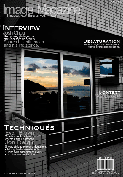
    Something i've worked on after checking out my friends photos:


    *I DID NOT TAKE THE PHOTO, IT WAS TAKEN BY MY FRIEND JOSH CHOU, WHICH I'VE HAD PERMISSION TO USE!*

    and yea C&C would be awsome!

    SUN-KEN-ROCK


    http://jayteare.deviantart.com/

    Cosmosys
    Intrinsic Nature will be back soon no worries.
    Gifts

  2. #2
    Join Date
    Jul 2007
    Location
    Lithuania
    Posts
    3,611

    Default

    14,99???
    wtf?
    and I see that you used only white color as a text.
    I think you could try colored version.


  3. #3
    Join Date
    Feb 2005
    Location
    Netherlands
    Posts
    1,068

    Default

    The layout is good be the text is placed all over the cover. Try to get some more structure. I guess the picture will be quite empty then, but fill it with something else. Maybe some solid or half solid block's can be added. something like bars for the bottum or the top?
    • meh,don'tlikesigs

  4. #4
    Join Date
    Aug 2008
    Posts
    125

    Default

    I would use another font. the one u used to type techniques is bad.. :/

  5. #5
    Join Date
    Jan 2007
    Location
    Minnesota
    Posts
    5,091

    Default

    I agree with pleymo. The text is everywhere which makes my eye really just draw from one side to the other. You should add a few solid rectangles in there and make it pop.

    The font could use some work. It's not making it for me. It just seems a bit too serious for a magazine. Magazines are supposed to be serious but they are also supposed to appeal to younger and older people, and well the font look kind of creepy no matter who you are.

    Oh yeah and also Never lower the opqacity on your header. That is your title. How are people going to know what magazine it is if they can't see the logo?
    You'd be looking at an ESPN magazine, then buy it. You'd get home and be like ahhhh **** this is actually sportsillustrated.

    lol. Nice attempt though, i like the selective coloring you use don the door.


    My DevART
    RATCHET is my bitch
    Andrew says:
    u ever stolen a bible?
    Apathy says:
    no
    used the last two pages to roll a joint though
    Andrew says:
    wow
    thats fucking hard core
    ^^HAHAHA, dm sucks XD


  6. #6
    Join Date
    Jan 2008
    Location
    Cali
    Posts
    523

    Default

    i'll try to come up with a v2 later thx for the C&C guys appreciated!

    SUN-KEN-ROCK


    http://jayteare.deviantart.com/

    Cosmosys
    Intrinsic Nature will be back soon no worries.
    Gifts

  7. #7
    Join Date
    Jul 2007
    Posts
    1,098

    Default

    I like it, not overly flashy and pretty decent layout.
    Just need a couple tweaks as suggested above.


Similar Threads

  1. Web magazine
    By Bill Beaton in forum Digital Art
    Replies: 6
    Last Post: 08-09-2005, 10:51 PM
  2. GFX Void Magazine-Ad
    By unit_number_43 in forum Battlegrounds
    Replies: 29
    Last Post: 05-23-2005, 06:22 PM

Posting Permissions

  • You may not post new threads
  • You may not post replies
  • You may not post attachments
  • You may not edit your posts
  •  
Powered by vBadvanced CMPS v4.1.1