0 members and 3,936 guests
No Members online

» Site Navigation

» Stats
Members: 35,442
Threads: 103,075
Posts: 826,688
Top Poster: cc.RadillacVIII (7,429)
|
-
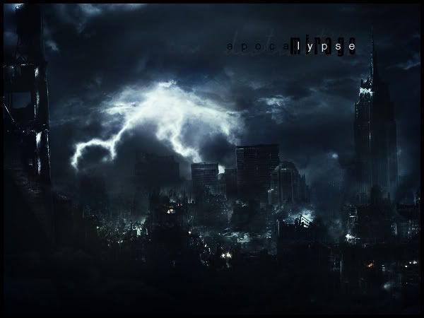
 Apocalypse Apocalypse
CnC?
-
awesome awesome awesome
great great great
amazing amazing amazing
cool cool cool
super super super
incredible incredible incredible
nice nice nice
perfect perfect perfect
-
lol what grais said in fewer words
thats freaking sick
nice work man
-
Looks freaking cool :O
Great job there.
Could we see the stock?
[LEFT] 
-
Yeah i'd love to see the stock, but from what i can see it's pretty cool. I like this a lot.
 My DevART
RATCHET is my bitch
Andrew says:
u ever stolen a bible?
Apathy says:
no
used the last two pages to roll a joint though
Andrew says:
wow
thats fucking hard core
^^HAHAHA, dm sucks XD
-
Looks awesome man, although the text is kinda crammed together there.
-
looks amazing but need stock to judge tbh cos it all could be just a pictue and you have added like a filter :S
-
WOW.
the theme of apocalypse shows greatly through there.
that's a hawt job man.
keep it up
-
It looks very kewl, but why did you make it so damn small? missing details. beside can i see the original? 
-
fits the theme great, but that text, i think, needs some work
Similar Threads
-
By Studhorse in forum Sigs & Manips
Replies: 5
Last Post: 06-13-2008, 03:41 PM
-
By Daemon in forum Sigs & Manips
Replies: 5
Last Post: 06-18-2007, 01:12 PM
-
By Smiling Demon in forum Digital Art
Replies: 2
Last Post: 06-01-2006, 11:47 AM
-
By SlaYer_prk. in forum Digital Art
Replies: 8
Last Post: 01-02-2006, 10:25 PM
 Posting Permissions
- You may not post new threads
- You may not post replies
- You may not post attachments
- You may not edit your posts
-
Forum Rules
|


 Reply With Quote


