0 members and 954 guests
No Members online

» Site Navigation

» Stats
Members: 35,442
Threads: 103,075
Posts: 826,688
Top Poster: cc.RadillacVIII (7,429)
|
-
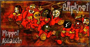
 Slipknot Slipknot
I had to use this render it was just to kool to let it wayste.
-
Hehe, that's a pretty funny render, I like it, the only thing I don't like is the BG colour, it just kinda looks like a mush of something but if you took away some of that brownish colour it might look better. Or at least in my eyes. :P It's a fun little sig.
 Originally Posted by MarkPancake

MarkPancake banned.
Success.
-
It's a grunge style sig thats why it looks that way.
-
It's a bit messy. I know your trying to be your own style but a few things to think about:
The whole transparent border thing went out of style awhile ago and tbh gives it no reason for being there. Borders separate the sig from the forum, so having parts of the sig beyond it render it useless.
The BG is okay, but it seems a bit messy. I'd like to see more flow next time and not have the BG and effects scattered so much.
the blending could also use work, however the colors are nice and the text actually kind of works with this one.
 My DevART
RATCHET is my bitch
Andrew says:
u ever stolen a bible?
Apathy says:
no
used the last two pages to roll a joint though
Andrew says:
wow
thats fucking hard core
^^HAHAHA, dm sucks XD
Similar Threads
-
By Garis in forum Sigs & Manips
Replies: 5
Last Post: 08-11-2007, 11:20 AM
-
By SyKo in forum Sigs & Manips
Replies: 10
Last Post: 02-18-2007, 05:19 PM
-
By nhl_rocker in forum Sigs & Manips
Replies: 0
Last Post: 02-11-2006, 06:32 PM
-
By Elektrik in forum Digital Art
Replies: 1
Last Post: 07-08-2005, 05:57 PM
-
By jerner in forum Digital Art
Replies: 15
Last Post: 03-25-2005, 05:23 AM
 Posting Permissions
- You may not post new threads
- You may not post replies
- You may not post attachments
- You may not edit your posts
-
Forum Rules
|


 Reply With Quote

