0 members and 685 guests
No Members online

» Site Navigation

» Stats
Members: 35,442
Threads: 103,075
Posts: 826,688
Top Poster: cc.RadillacVIII (7,429)
|
-
 new sig i made any thing that i could improve on it new sig i made any thing that i could improve on it
new sig i made any thing that i could improve on it ?

-
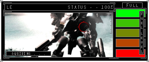
It's a bit messy. I would try to clean it up a bit and make it more easily seen.
The render being green doens't really go with a red BG. I would try to change the color. Also add a lightsource. it's really dark and you need a place to brighten it up.
 My DevART
RATCHET is my bitch
Andrew says:
u ever stolen a bible?
Apathy says:
no
used the last two pages to roll a joint though
Andrew says:
wow
thats fucking hard core
^^HAHAHA, dm sucks XD
-
The render is very difficult to see. I like the effects on the background, but they distract from the render itself. There just isn't enough contrast. I'm also not a fan of the white border you're using, since it's the lightest thing in the sig.
-
i am at odds with colours beacuse i went with red beacue red symoblizes arger wihich the hulk lol but what about this green. plus i wasn't completly going for a focus on the render sig for once lol decided to put the hulk in there later on sig would prob look better if i took the hulk out, was just toying about with teh hulk having my tag in his hand at the time will prob dosomthing else with him in. but here is the green back ground one.

-
-
Add some more lighting, which give it more depth and look not so flat. Turn ur font opacitiy a little higher or make it more whiter.
-
From what I've seen of your signatures, I would say that the textures over-dominate.
Try smoothing out the places not of focus.
For example, it seems like your render is the main focal point of the sig. I would completely remove the textures from the background, and reposition the render slightly more towards the centre.
It's a nice cartoon effect with the text style on the hand, though the texture brushing doesn't fit with the comic render.
Blocks of colour and clean lines work would work well with all of the anime and comic characters that you've used.
-
this any better?

Similar Threads
-
By xseth99x in forum Digital Art
Replies: 5
Last Post: 12-07-2006, 04:54 PM
-
By Crunks in forum Digital Art
Replies: 1
Last Post: 10-08-2006, 08:40 AM
-
By Tenchido in forum Sigs & Manips
Replies: 4
Last Post: 07-24-2005, 05:43 PM
-
By MartinBabies in forum Digital Art
Replies: 1
Last Post: 06-02-2005, 07:26 AM
-
By HeadShot in forum Sigs & Manips
Replies: 7
Last Post: 03-27-2005, 07:08 PM
 Posting Permissions
- You may not post new threads
- You may not post replies
- You may not post attachments
- You may not edit your posts
-
Forum Rules
|


 Reply With Quote


![[PHXN] New001's Avatar](image.php?u=7015&dateline=1264038258)
![Send a message via Yahoo to [PHXN] New001](http://www.gfxvoid.com/forums/images/misc/im_yahoo.gif)


