0 members and 3,874 guests
No Members online

» Site Navigation

» Stats
Members: 35,442
Threads: 103,075
Posts: 826,688
Top Poster: cc.RadillacVIII (7,429)
|
-
-

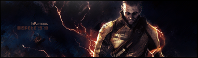
the first ones okay, the contrasts a little off.. Blend he render in, and put it in a better place. Use the render for the background, smudge it in, This gives a better sense of colour to it.
With the second one,sorry but it is rubbish, The c4d in the background is pontless, It adds no flow and is just a distraction from the overall focal point.
-
-
These are a bit overcontrasted i think is the problem. First one is really dark. And the BG should be blurred a behind lil weezy.
The second the Bg just needs some work. it seems a bit busy and i think you should try using a stock with that, it might look like of cool. SMudging might work well too.
 My DevART
RATCHET is my bitch
Andrew says:
u ever stolen a bible?
Apathy says:
no
used the last two pages to roll a joint though
Andrew says:
wow
thats fucking hard core
^^HAHAHA, dm sucks XD
-
Eww sorry but neither of them are very good.
Needs better Depth and better use of effects. 2nd one has no flow at all
and 1st is over contrasted
Similar Threads
-
By -Junaid- in forum Sigs & Manips
Replies: 5
Last Post: 07-26-2008, 03:24 PM
-
By 2re in forum Introductions
Replies: 3
Last Post: 05-05-2008, 09:19 AM
-
By Engage in forum Sigs & Manips
Replies: 1
Last Post: 08-16-2006, 01:11 PM
-
By Krimsyn in forum Digital Art
Replies: 1
Last Post: 03-31-2006, 11:39 PM
-
By colin826 in forum Sigs & Manips
Replies: 3
Last Post: 11-05-2005, 12:42 AM
 Posting Permissions
- You may not post new threads
- You may not post replies
- You may not post attachments
- You may not edit your posts
-
Forum Rules
|


 Reply With Quote