GFXVoid Graphic Design Forum

Remove Text Formatting
Loading...

» Online Users: 7,003

0 members and 7,003 guests
No Members online

» Site Navigation

 > FAQ

» Stats

Members: 35,442
Threads: 103,075
Posts: 826,688
Top Poster: cc.RadillacVIII (7,429)
Welcome to our newest member, Lekelindids
Results 1 to 9 of 9

Thread: Star Wars Sig

  1. #1
    Join Date
    Sep 2008
    Location
    Frankfurt, Germany
    Posts
    41

    Default Star Wars Sig


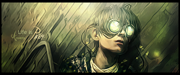
    I didn't add a text, cuz I hadn't a good Font that fits here, as always. :/

    C&C, plx.


  2. #2
    Join Date
    Jul 2008
    Location
    Manchester, England
    Posts
    929

    Default

    Wow nice depth and nice flow, lighting is good and so is compo text would complete this tag so try and find nice text Overall Nice Job (Y) i really like it


  3. #3
    Join Date
    Sep 2008
    Location
    Frankfurt, Germany
    Posts
    41

    Default

    Thx4Feed. ^^

    Any more comments?


  4. #4
    Join Date
    Aug 2008
    Location
    The netherlands
    Posts
    903

    Default

    looks kewl
    not much to say about it
    it's just coolxD

    WHAT'S THIS?! A SIGNATURE?

  5. #5
    Join Date
    Feb 2008
    Location
    Toronto, Canada
    Posts
    4,831

    Default

    friggin hot.
    that's a sick sig man.
    write a tutxD


  6. #6
    Join Date
    Jan 2007
    Location
    Minnesota
    Posts
    5,091

    Default

    Border is killing it for me. Overall though it's pretty nice. Would be cool to see a sig that isn't colored purple/orange though.

    Nice effects and great BG.


    My DevART
    RATCHET is my bitch
    Andrew says:
    u ever stolen a bible?
    Apathy says:
    no
    used the last two pages to roll a joint though
    Andrew says:
    wow
    thats fucking hard core
    ^^HAHAHA, dm sucks XD


  7. #7
    Join Date
    May 2008
    Posts
    432

    Default

    Nice coloring. The guy is a bit dark, but that might just be the render.
    .:Some of My Best:.

  8. #8
    Join Date
    Sep 2008
    Posts
    1,589

    Default

    I agree with all of above and also would like to add TuT please :d

  9. #9

    Default

    hmm its a nice sig but i kinda miss the dark parts on the left and the right

    nothing more to add just a cool thing and u dont need a ext on every sig ..thats not necessary on every sig some texts are really ruining a sig so my opininon: keep it out than making ur sig worse
    ...:newest:...

Similar Threads

  1. Star Wars
    By ACiD in forum Sigs & Manips
    Replies: 7
    Last Post: 12-23-2005, 01:02 AM
  2. Star Wars
    By ACiD in forum Digital Art
    Replies: 7
    Last Post: 12-21-2005, 09:43 PM
  3. star wars
    By Old-Skool in forum Digital Art
    Replies: 2
    Last Post: 09-20-2005, 07:13 PM
  4. Star Wars
    By Undertaker in forum Digital Art
    Replies: 3
    Last Post: 08-16-2005, 09:40 PM
  5. star wars sig
    By IndoSilver in forum Sigs & Manips
    Replies: 6
    Last Post: 06-13-2005, 09:23 AM

Posting Permissions

  • You may not post new threads
  • You may not post replies
  • You may not post attachments
  • You may not edit your posts
  •  
Powered by vBadvanced CMPS v4.1.1