0 members and 5,712 guests
No Members online

» Site Navigation

» Stats
Members: 35,442
Threads: 103,075
Posts: 826,688
Top Poster: cc.RadillacVIII (7,429)
|
-
-

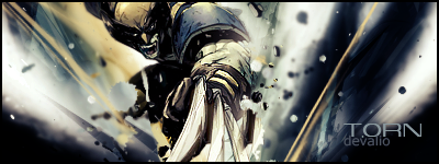
Nice concept, although you might want to put a border between the different shots instead of just a fade. That or make it blend smoother. I would also choose a simpler font maybe? Try a sans serif? I am also not a fan of solar flares, especially if they are so obvious. Try different ways to create a light source and don't have so many. Overall I like 2, 4 and 6 best.
-
-
I agree with basically everything De Val said. You beat me to it  . Just one more thing, maybe try adding a nice light source on the top left of the sig, it would compliment the focal. . Just one more thing, maybe try adding a nice light source on the top left of the sig, it would compliment the focal.

"Judge a man by his questions,
not his answers."
-Voltaire
-
-
Right i agree with all the above but try and use some of the tutorials here it gives you the basics of a nice looking sig 
Similar Threads
-
By CuBa in forum Sigs & Manips
Replies: 4
Last Post: 09-10-2005, 03:29 PM
-
By CuBa in forum Sigs & Manips
Replies: 10
Last Post: 08-30-2005, 01:34 AM
-
By ROTD in forum The Void
Replies: 61
Last Post: 07-17-2005, 12:05 AM
-
By Morphius in forum Sigs & Manips
Replies: 13
Last Post: 03-01-2005, 03:47 PM
-
By Morphius in forum Sigs & Manips
Replies: 9
Last Post: 02-06-2005, 11:28 AM
 Posting Permissions
- You may not post new threads
- You may not post replies
- You may not post attachments
- You may not edit your posts
-
Forum Rules
|


 Reply With Quote