0 members and 377 guests
No Members online

» Site Navigation

» Stats
Members: 35,442
Threads: 103,075
Posts: 826,688
Top Poster: cc.RadillacVIII (7,429)
|
-
 New New
-
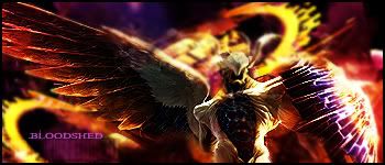
Very nice effects, and the background looks sweet. A bit over contrasted though, the light and dark is very close together. Render is a bit dark.
Text isn't bad looking, I kind of like it. :P
It has a nice flow, but those big orange flames in the background should be in line with the render's wing just to keep the flow going one way.
Nice tag. 
 Originally Posted by MarkPancake

MarkPancake banned.
Success.
-
I agree with Ptka, and would like to add that there could be a bit more blending with the background. Besides the yellow curves in the background, the render's colors match adequately with the background, so it shouldnt be hard to mend the render in a little bit to make it look like its more part of the sig itself instead of just being on it.
However, the positioning of the render seems to be great, the text isnt bad, and there's a blur for the background which makes the sharpened render stand out more, but I learned even just recently that more than just the render has to be sharpened so that it fits better with the sig, just a more in depth blending I guess lol.
Good job dude, w/ these handy lil tips Ptka and I gave, along w/ any1 else who'd like to join in , your sig'll be top shape soon 
Newest

-
thanks guys....its cool i have been searching for a forum where people actually gave me pointers on how to make my stuff better......helps people get better at what they are doing.....thanks again and hopefully you can help me become a much better graphics artist
-
Also check out some of the tuts we have, good ones include Immortal's, Papa's, Garis', Elramo's and many others.
Originally Posted by MarkPancake
MarkPancake banned.
Success.
-
I totally disagree with Ptka. I think it's bad. It just has this fake feeling to me when I look at it, like the render just doesn't fit with the background. It doesn't seem to have that controlled sense that you get when you see good sigs. As for the text it doesn't fit as well as it should, next time try lowering the opacity. The background is over blurred and that helps in making the render seem awkward and sticking outish. Also in my opinion bad choice of render. So all in all mediocre and needs alot of improvement.
 Posting Permissions
- You may not post new threads
- You may not post replies
- You may not post attachments
- You may not edit your posts
-
Forum Rules
|


 Reply With Quote


